A 36-line wood type card/object congratulating Sandra & Harry Reese upon being awarded the Oscar Lewis Award by the Book Club of California, 30 March 2015.

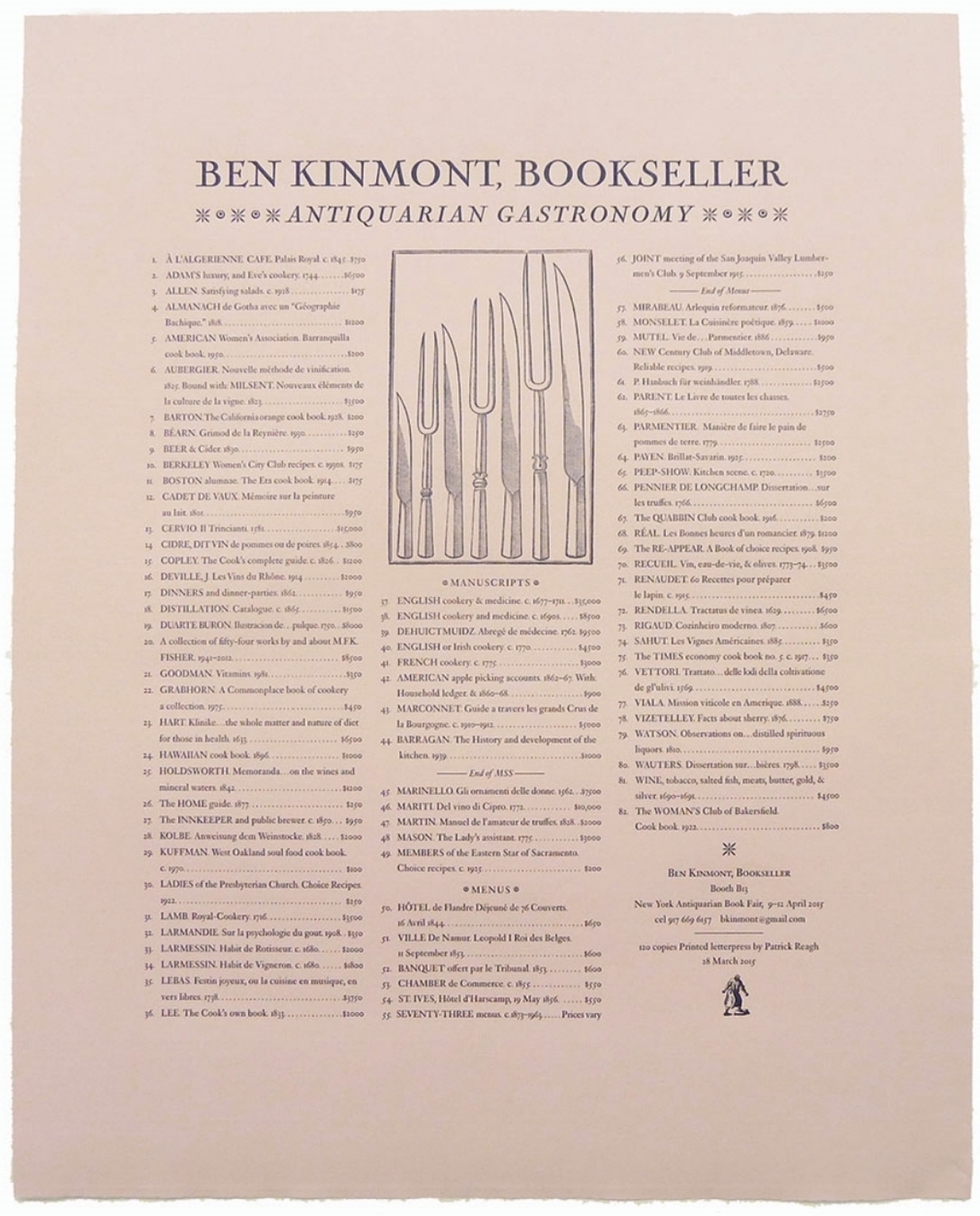
Printed letterpress, March 28, 2015. 16 x 20.75 inches.

Cast 6 fonts of this old typeface for a client in Canada
from mats that are probably 80–90 years old. April 2, 2015. Additional fonts available from our store.
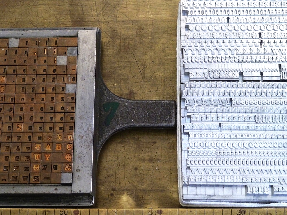
Mats & type
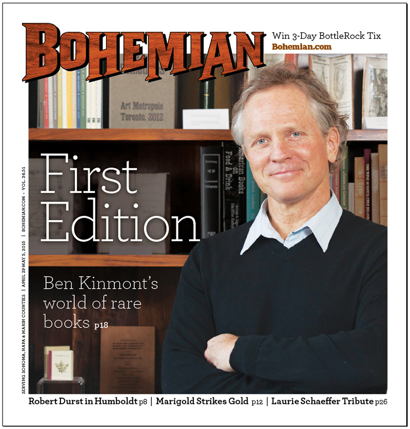
My friend and client, Ben Kinmont was featured in the Northern California independent tabloid Bohemian. Congratulations, Ben.
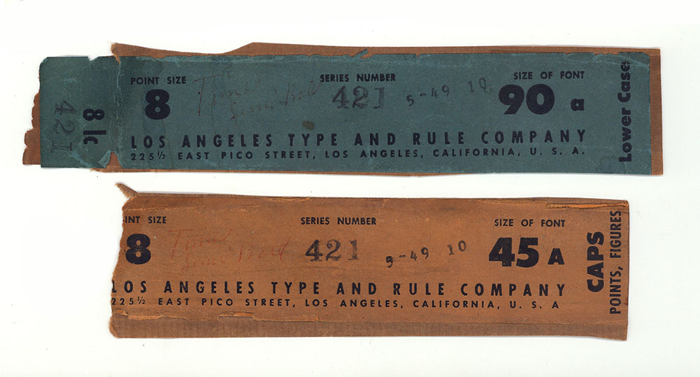
My friend Eric Johnson of Iota Press came upon these labels on some unopened fonts (8pt. Times New Roman Semi-Bold) from 1949. Los Angeles Type And Rule Company was my favorite place as a teenage printer. All my allowance money went to them.
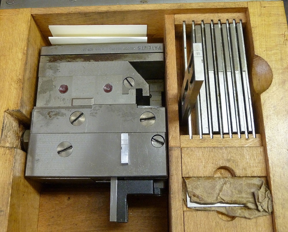
Monotype Quad and Space mold. I acquired this mold years ago but never used it. It is for casting spaces from 5 to 12 point. What makes it unique is it has a pin mark for identifying the size on the side of each space. It would be useful for less experienced printers in identifying odd sizes like 11 point to avoid improper distribution.
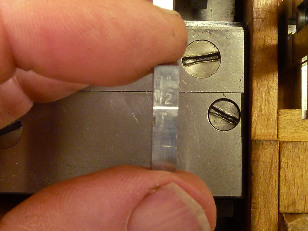
First casting on 24 June, 2015 .with the Quad and Space mold. The size (12pt.) shown on the side. Pretty cool, eh?
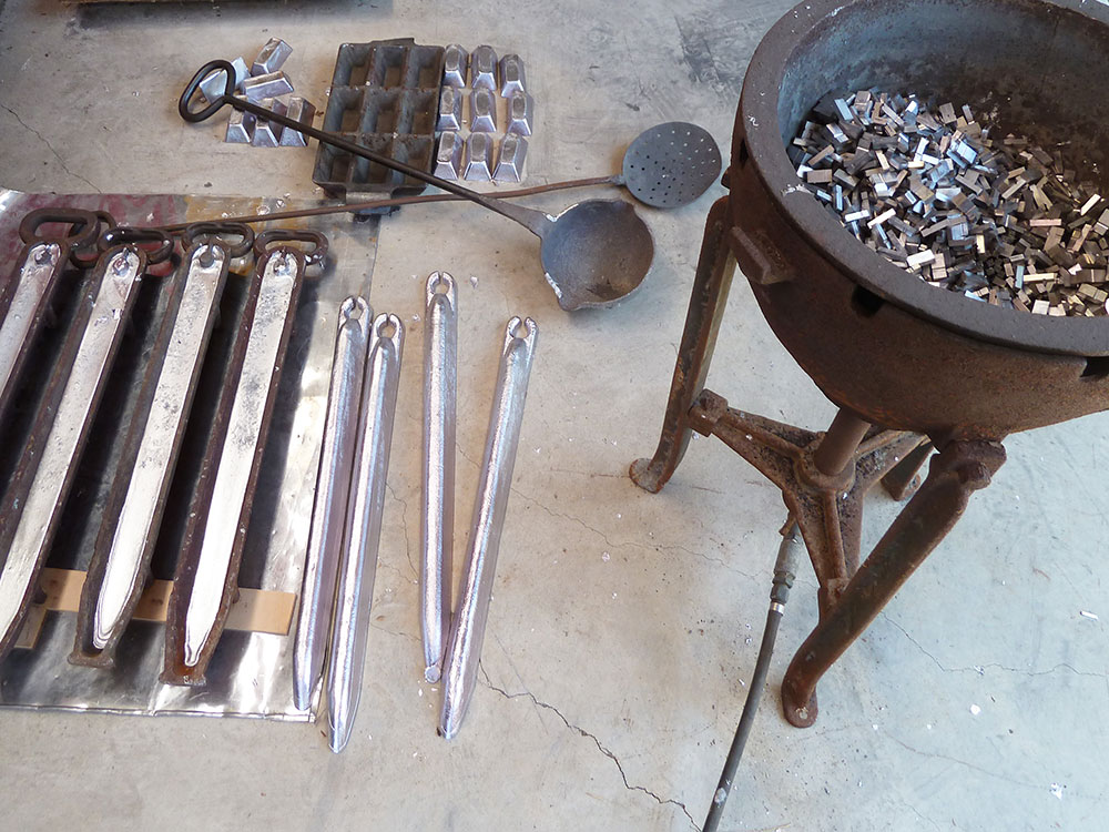
Out with the old, in with the new. Recycling is alive and well at Patrick Reagh Printers. The ancient cauldron, some old type, a propane tank, and voilà! New ingots ready to be turned into beautiful new type. It goes without saying that this beautiful new type is available from our store.

A prized possession. Inscribed copy of Hermann Zapf-Ein Arbeitsbericht (work report). While in San Francisco for the Hermann & Gudrun Zapf Day celebration in 2001, the master graciously and beautifully signed my copy of his book. An old package of Optima italic caps from Stempel is another treasured artifact related to the great type designer.
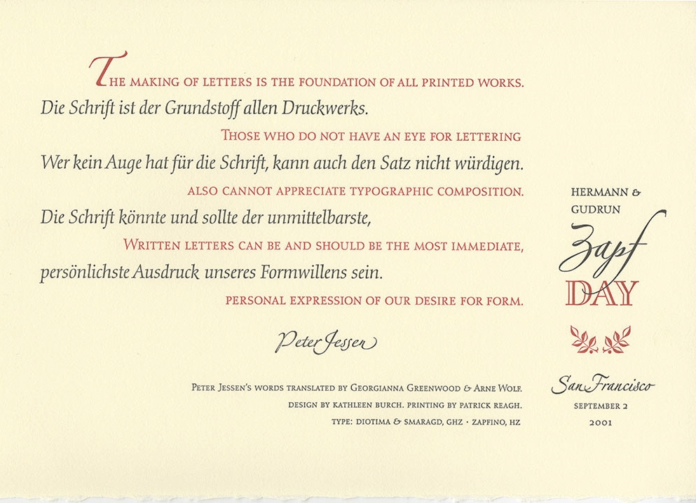
A keepsake for the Hermann & Gudrun Zapf Day celebration. Designed by Kathleen Burch and printed by yours truly. Rest in peace, Hermann.
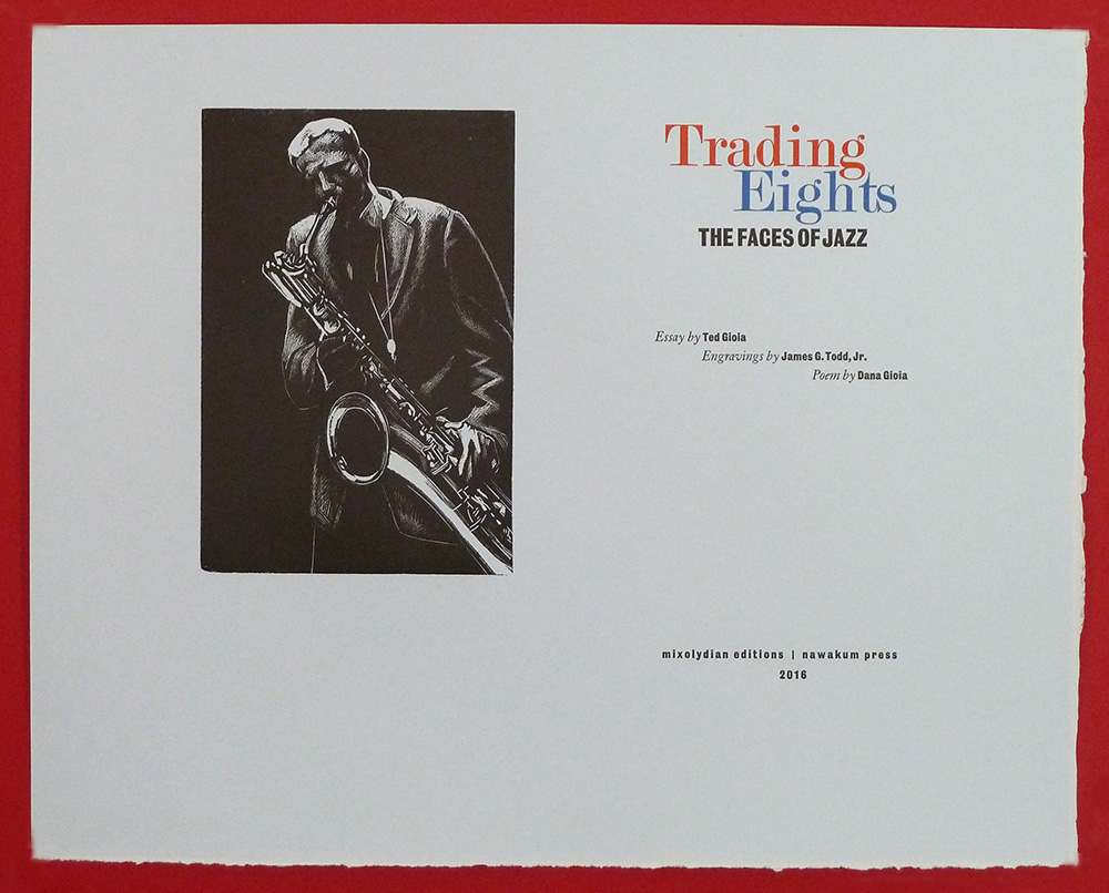
Title page and frontispiece for a new book from Nawakum Press and Mixolydian Editions. The title page printing and monotype composition were done at the shop and the blocks and text were printed by Richard Wagener.
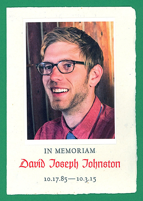
The family, friends, and letterpress community suffered a devastating loss with the sudden death of Dave Johnston. He, along with Mark Sarigianis, operated the Prototype Press. A large gathering attended a memorial on Friday, 9 October at Cragmont park in the Berkeley Hills. We will always cherish your memory, Dave.
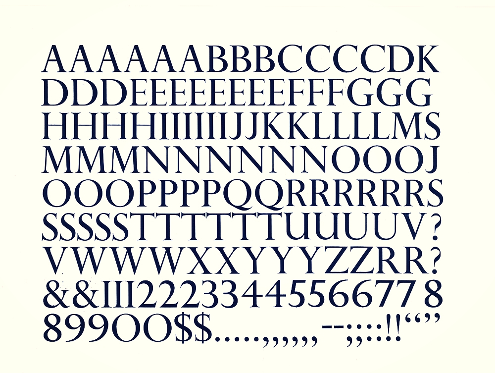
Our latest casting from some newly discovered mats from the depths of our collection. Fonts are available from the store.
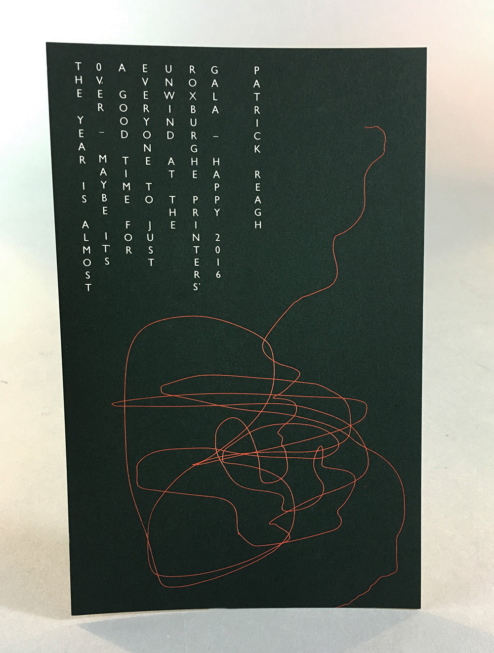
Printed for the Roxburgh Club annual Printers' Gala. December 15, 2015. A registration nightmare.
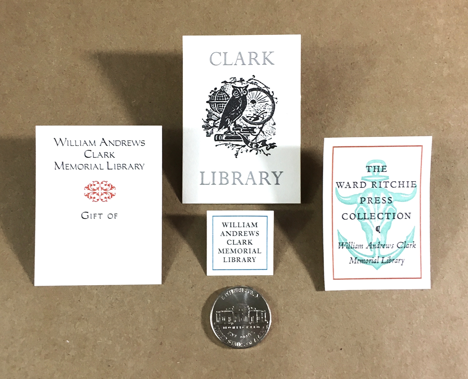
Newly printed bookplates for the Clark Library. The small book-
plate is 15/16ths of an inch square.
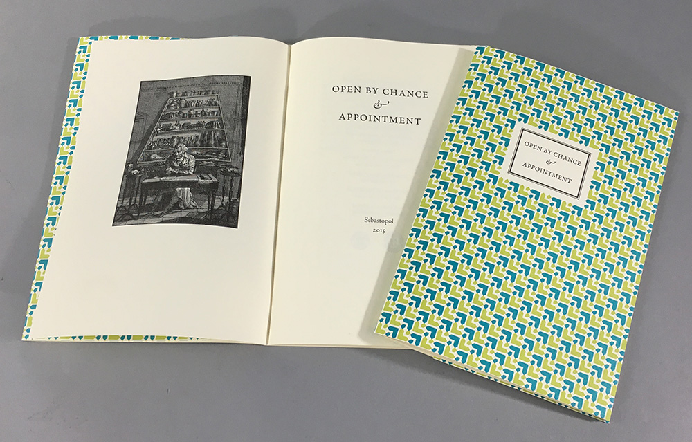
An account of Ben Kinmont's store in Sebastopol where he conducted business until the Spring of 2016. The title is from the sign on the door. Chances were that there was usually someone on the premises.

The interior of Ben's bookshop
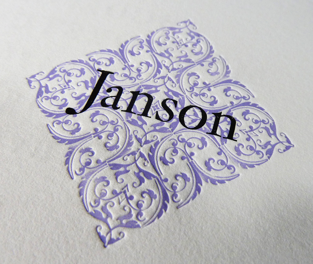
A colleague recently lent me the matrices for 24, 30 & 36 point Janson roman and italic. The Press now has a complete supply from 8–36 point.
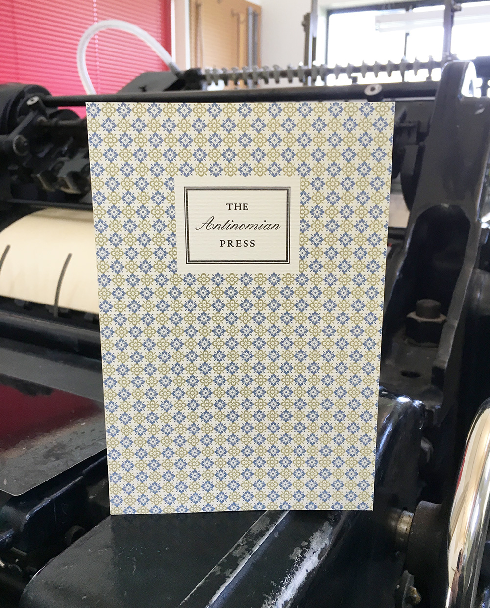
Antinomian Press Bibliography. Printed 21 February 2016. Another printed-pattern-paper-covered booklet for Ben Kinmont. Alliterations abound.
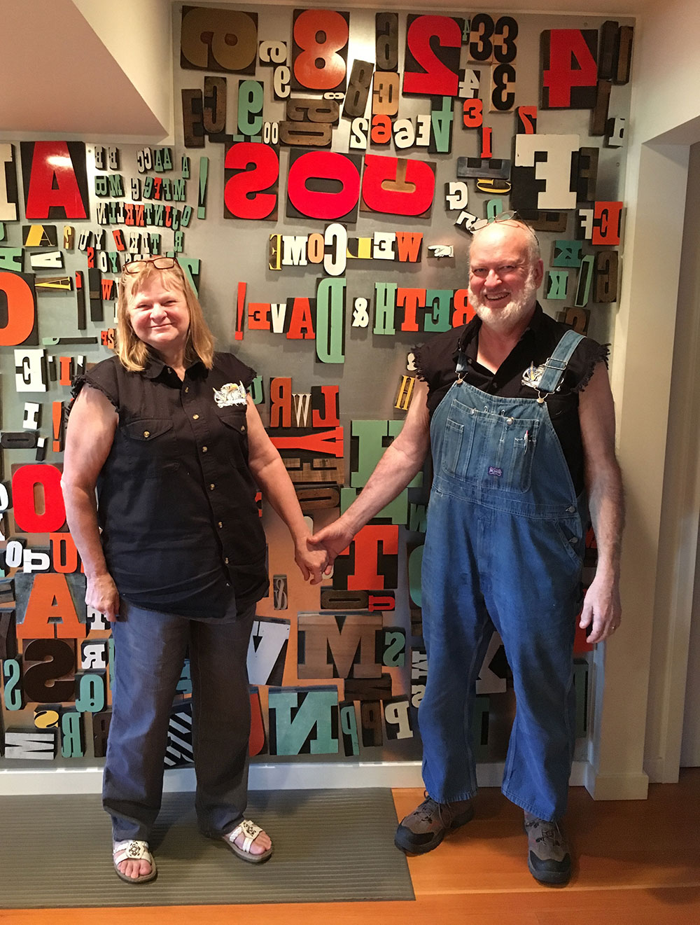
Dave & Beth Seat
http://www.hotmetalservices.com
travel the country servicing hot metal equipment.
A day's work in my shop, and they gave the machines a new lease on life.
They are a national treasure.
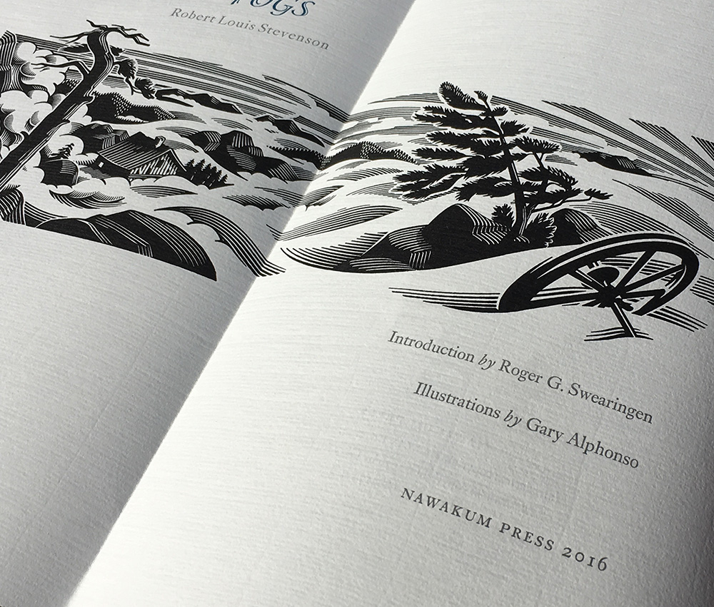
Detail from the title page of The Sea Fogs by Robert Louis Stevenson. A limited-edition published by David Pascoe of the Nawakum Press.
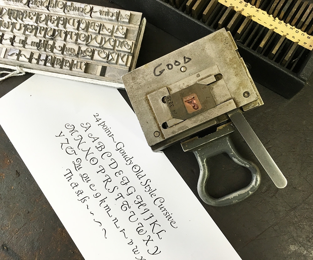
Still life with type, matrices and proof. Six fonts were cast on September 8, 2016 and sold out within 8 hours. A second casting is underway. Fred would be proud.
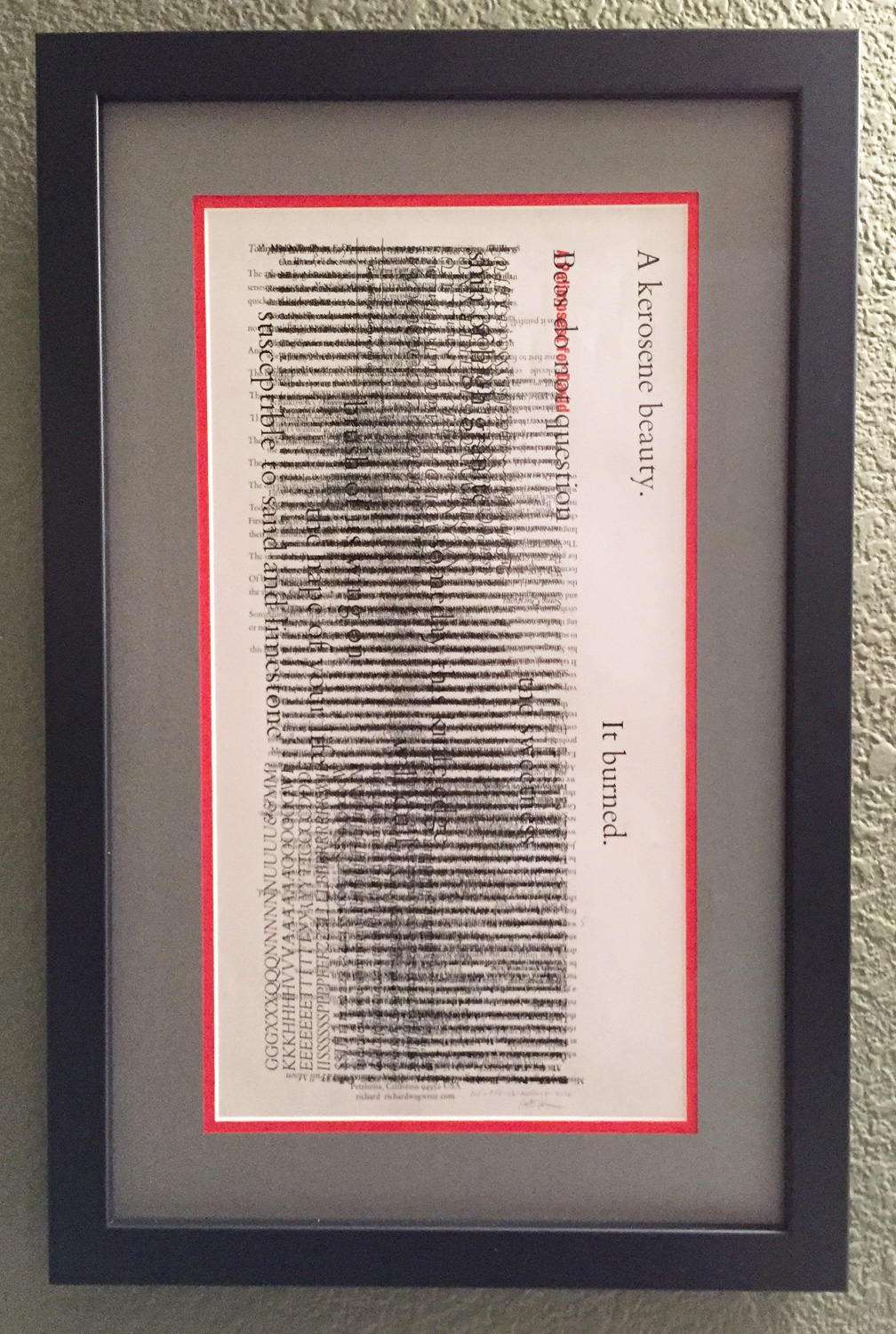
Many-proofed sheet for David Pascoe from type cast for several Nawakum Press publications. September, 2016.
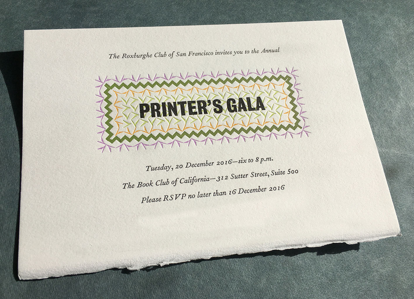
An invitation using the Flight Borders. Fonts of Flight Borders are available at the Store.
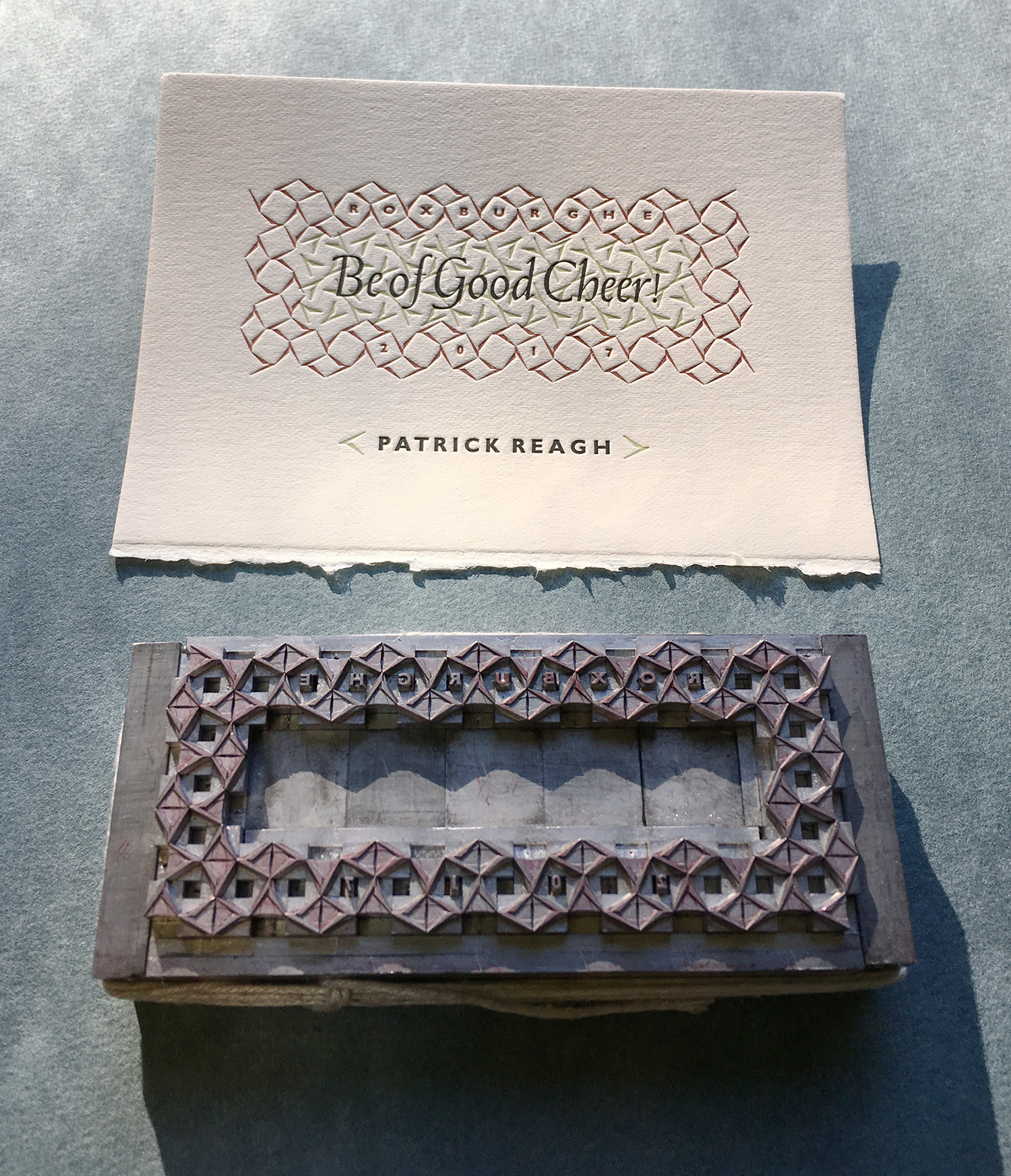
Another example of the fabulous possibilities of using the Flight Borders. Included here is the type used to print the frame. Flight Borders are available at the Store..
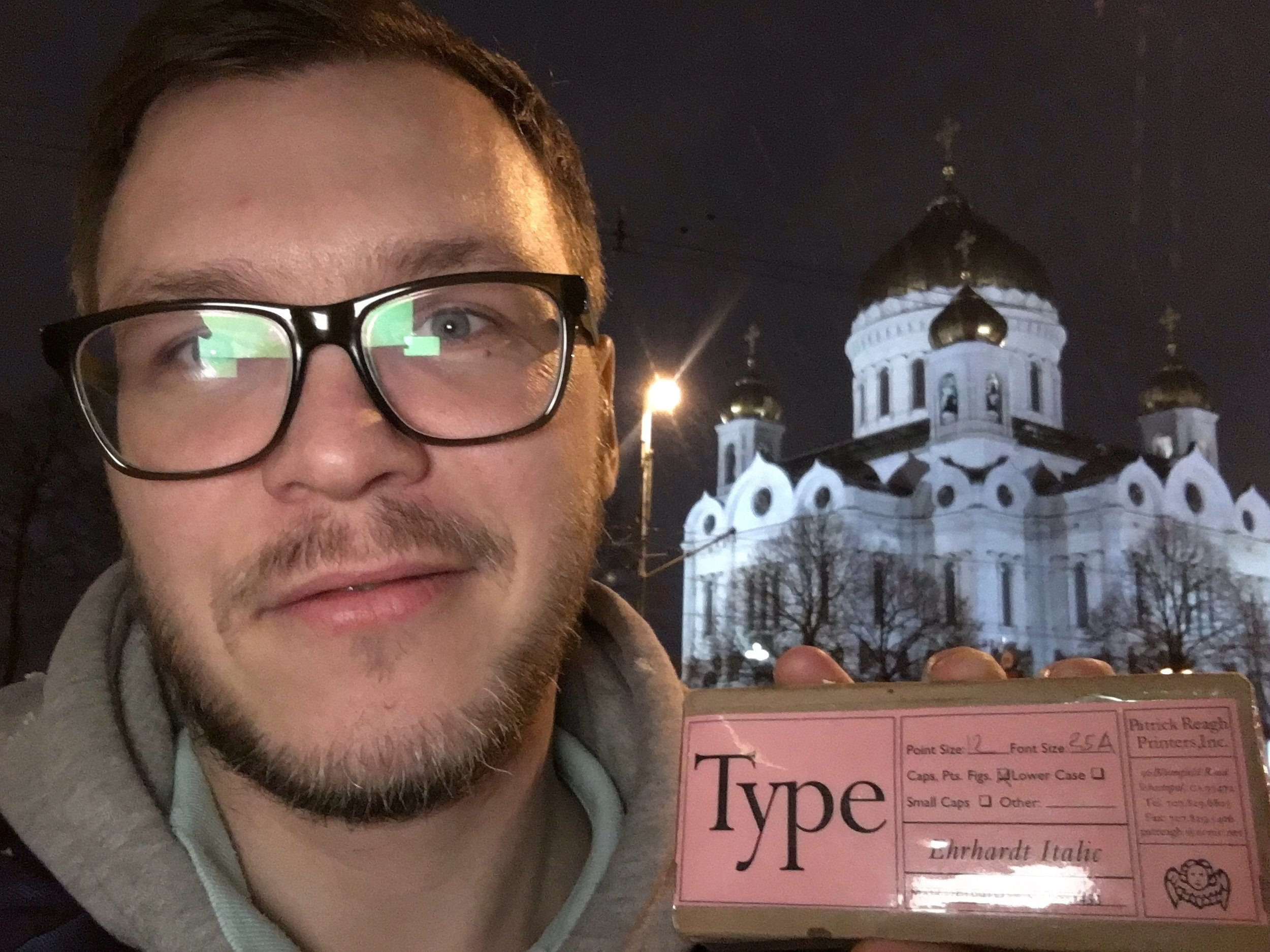
This is a picture of Konstantin Lukjanov, our first type purchaser from Russia. Behind him is the The Temple of Christ the Savior in Moscow. It will be interesting to see how he plans on using Ehrhardt. His work can be viewed at maga-book.ru. Stay warm, Konstantin.
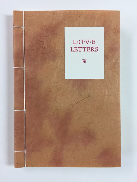
We were pleased to be informed that the St. Brigid Press of Emily Hancock utilized our Goudy Old Style in her latest publication.
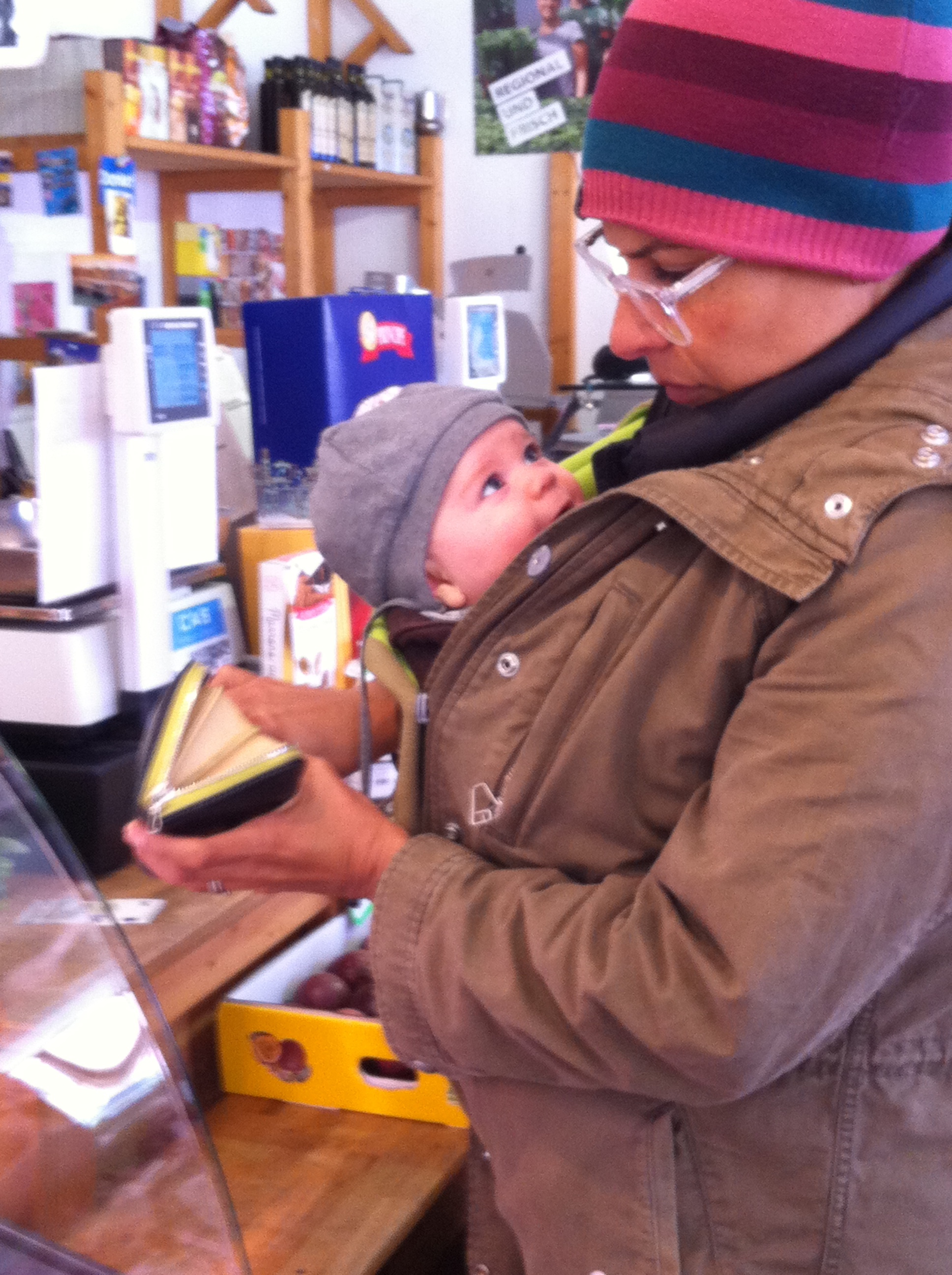
In April, 2017, we went to Munich, Germany to meet my four-month-old grand-daughter, Emmie. It was cold, but mother (my daughter, Eleanor), and daughter were all cozy and bundled up.
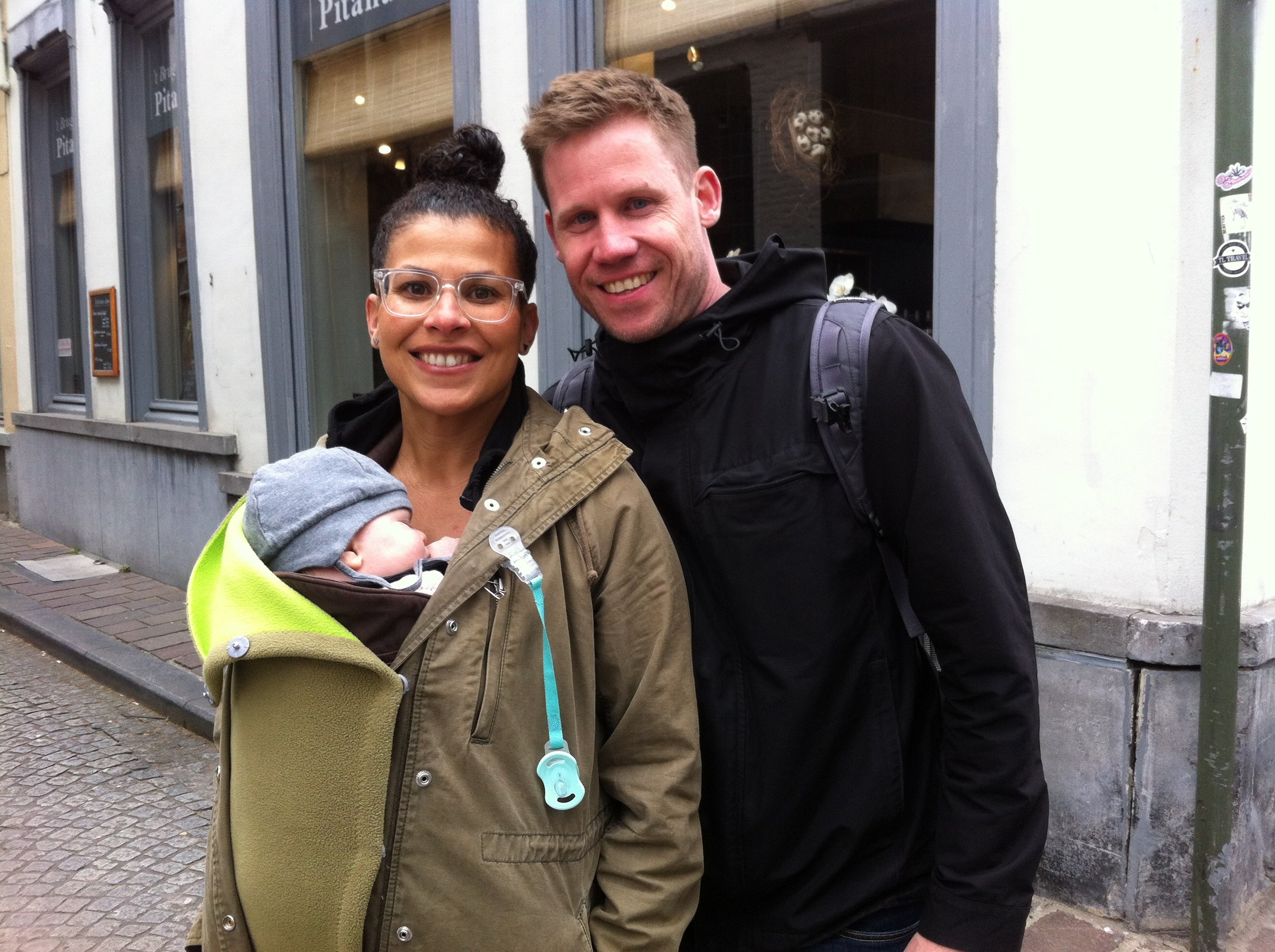
Eleanor, Armin and Emmie taking a stroll on Zeppelinstrasse. (Blimp Street?)
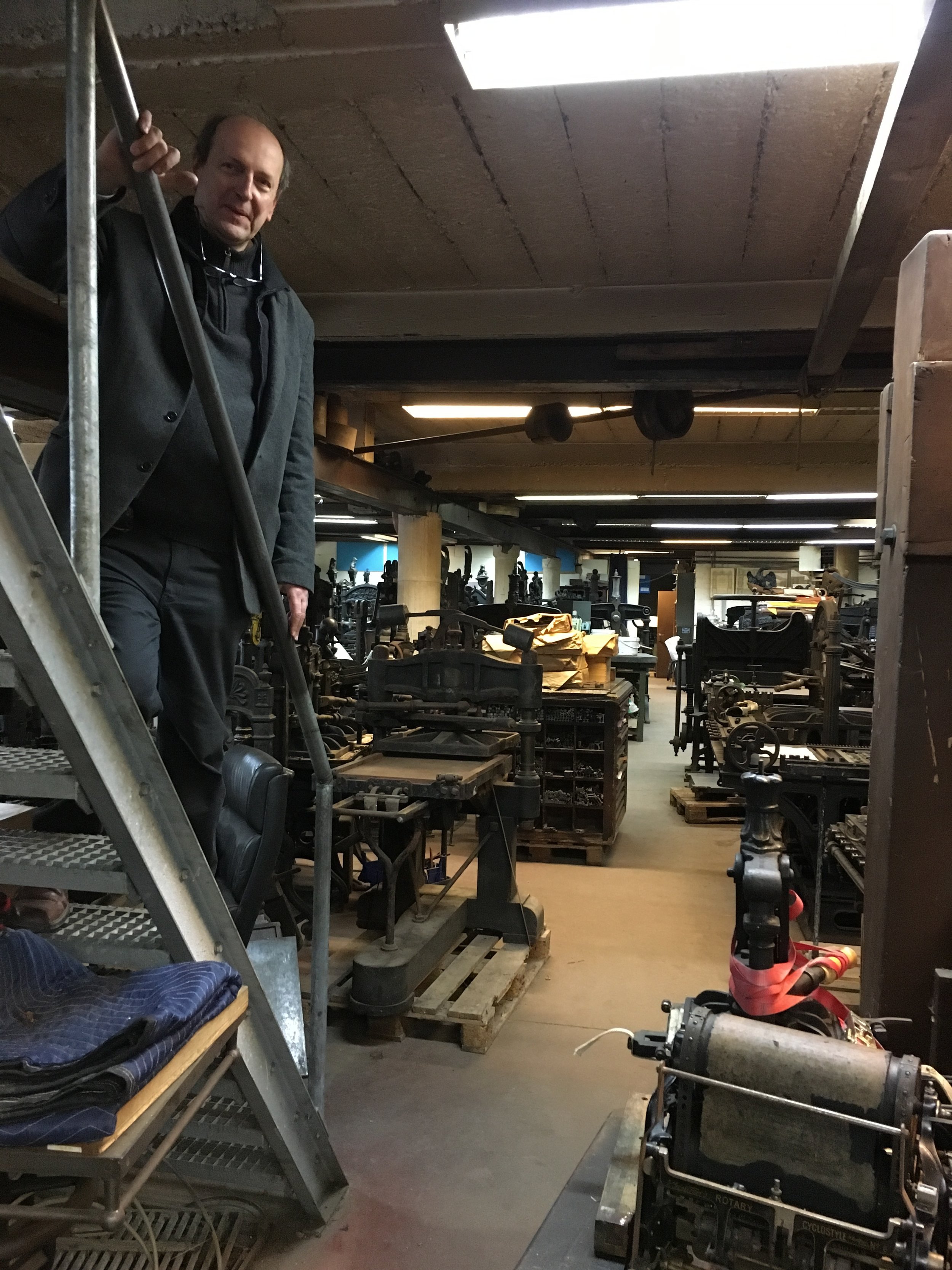
After going to Munich and Brugges, we went to Antwerp on 5 May, 2017 to visit the Plantin-Moretus Museum and see my friend Patrick Goosens. His collection of old presses and printing and typecasting equipment is beyond belief. I would have liked to have spent a month there. He also manages his family's venerable bakery, the oldest in Antwerp.
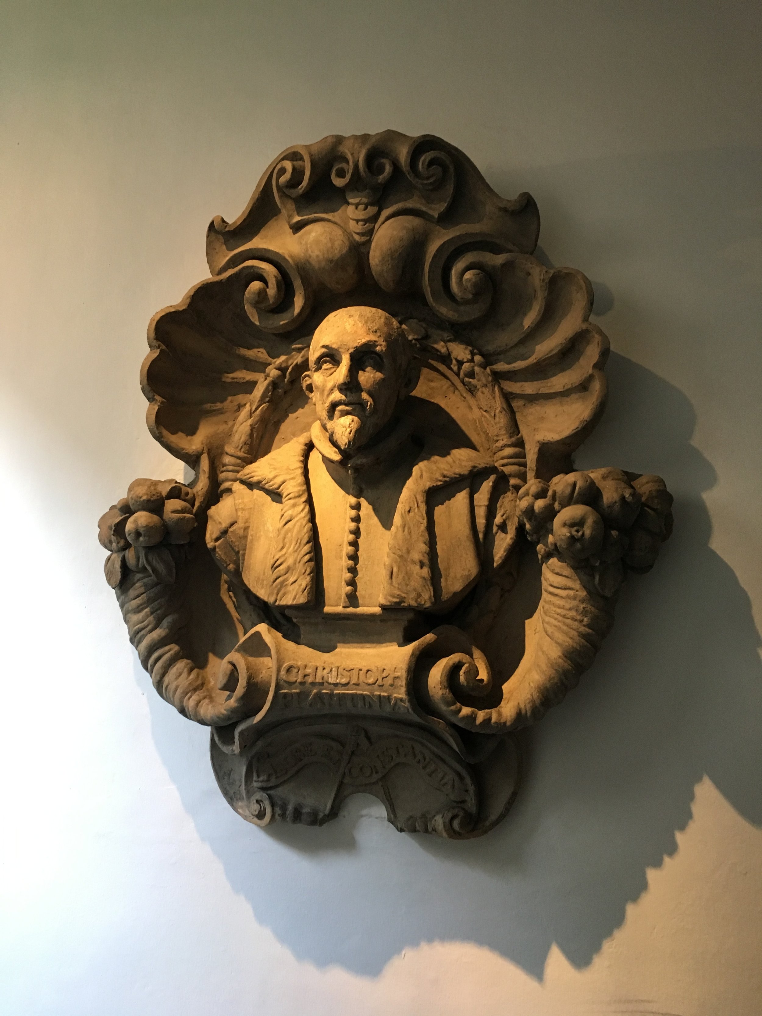
Along with Gutenberg and Aldus Manutius,
one of the most consequential printers in history. This sculpture is in the Plantin-Moretus museum in Antwerp.
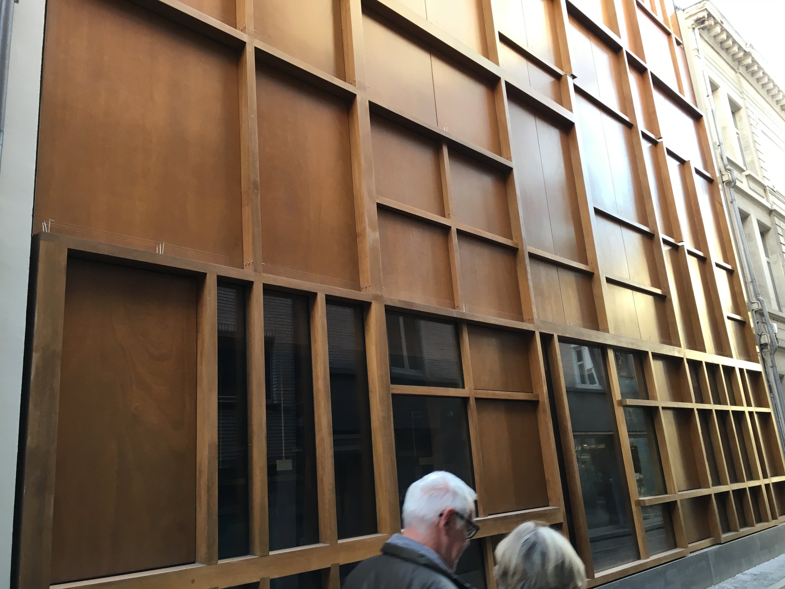
The wall of the reading annex of the Plantin-Moretus museum. Needless to say it mimics a typecase.
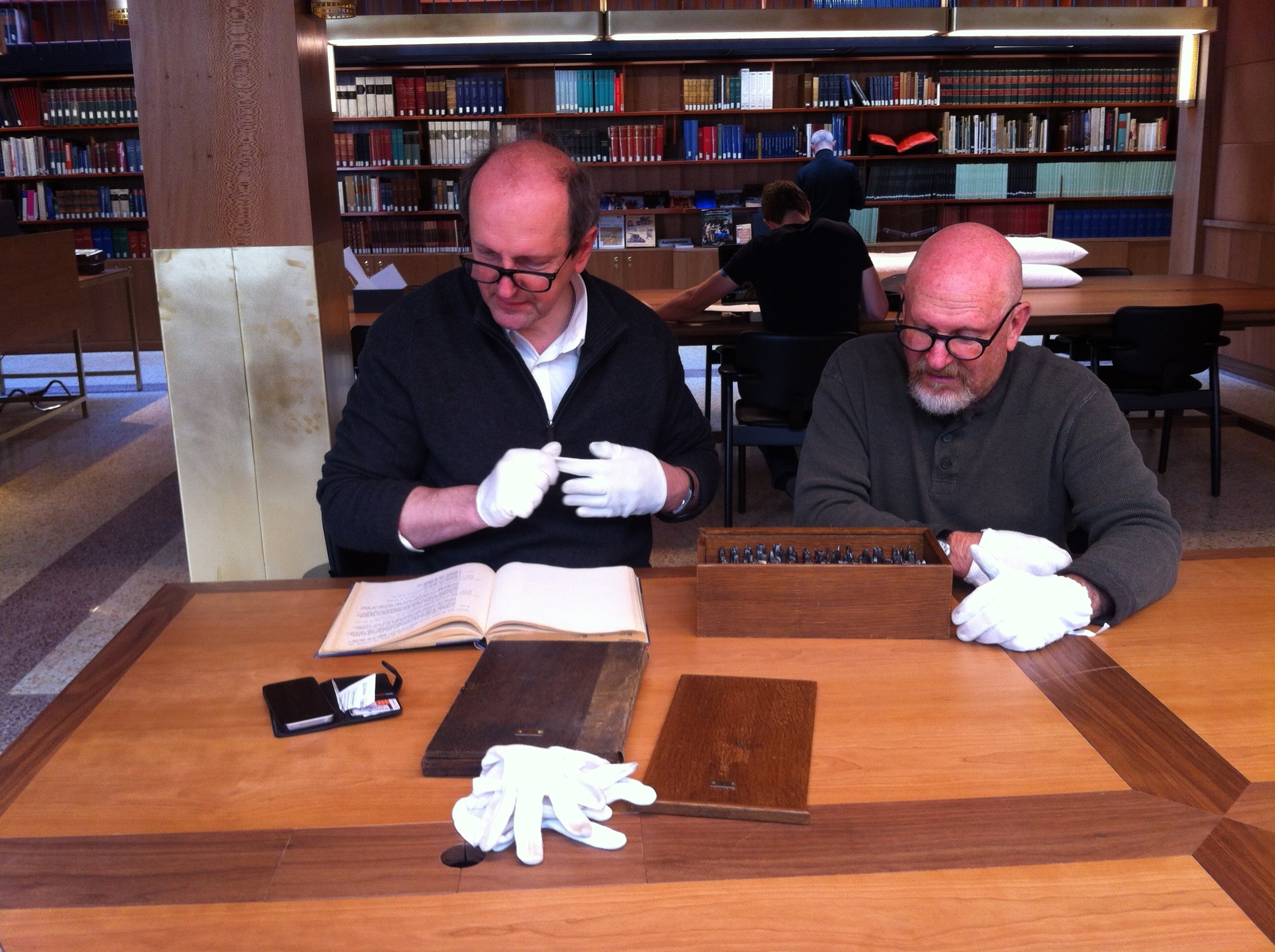
Examining and caressing original punches and matrices for a font of large Garamond, probably about 48 point. I was doing my best to not drool.
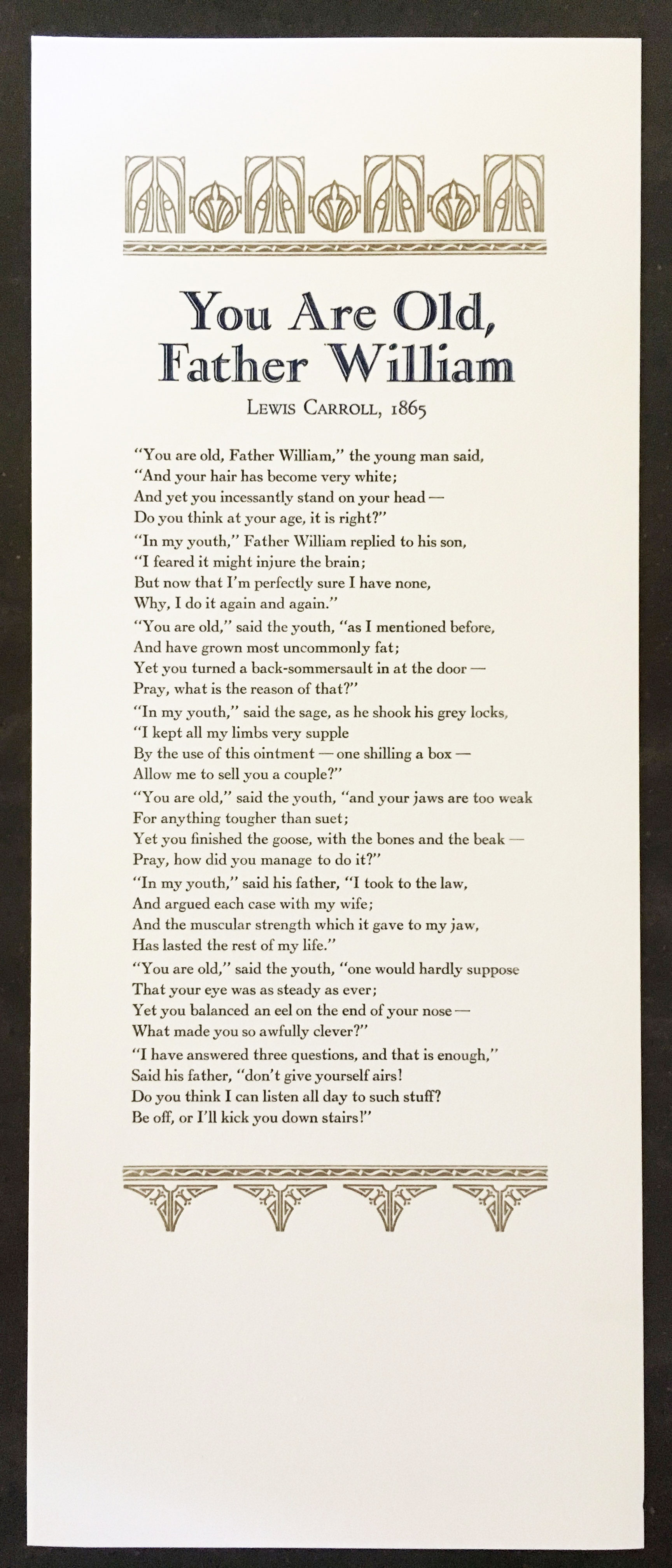
A wonderful handset version of the classic poem from Alice's Adventures in Wonderland. Printed by Lawrence Peterson of Nine-eighteen-thousandths Press. The text is set in 12 point Cochin purchased from our foundry. Well done, Lawrence.
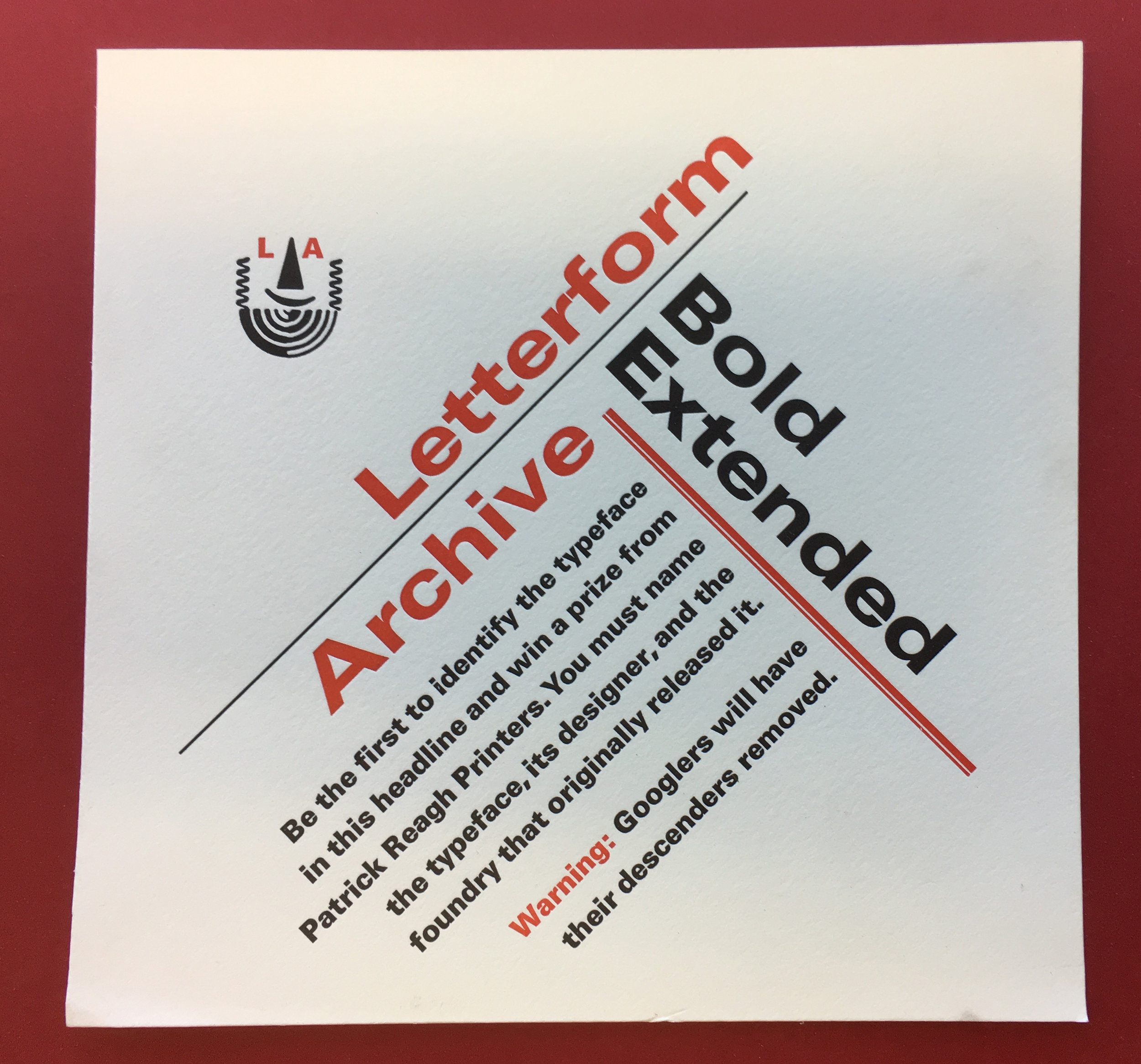
A keepsake printed for the Letterform Archive's soirée (16 June 2017) announcing its new addition. The contest mentioned was won by Bruce Kennett who is also the author of a major new book about W A Dwiggins.

The form for the red type.
The terrible Sonoma County fires of October 2017 claimed the home of David and Patricia Pascoe. The inventory of their Nawakum Press was also lost. We were fortunate to have participated in the printing of many Nawakum books. This is a sad affair, but the Pascoes are sturdy people, and we know that they will be back in the swing of things in no time at all. Our hearts go out to them and all the people in our part of the world who suffered a similar fate.
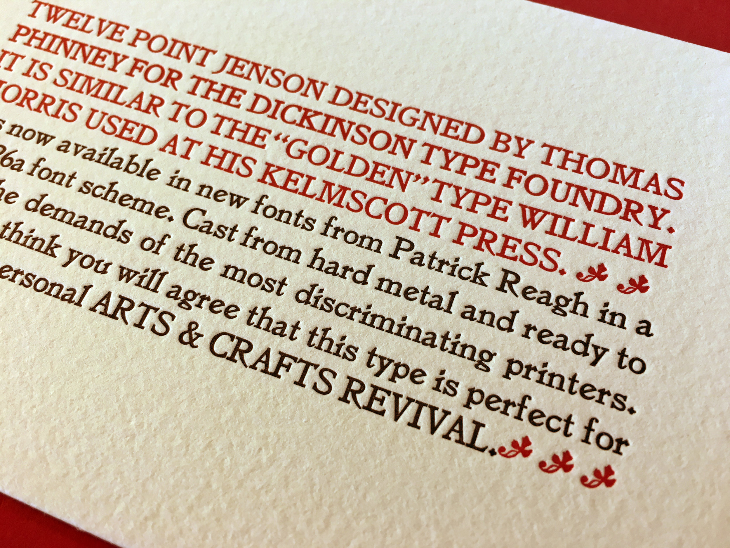
Some long-forgotten matrices of 12 pt. Monotype Jenson #58 were recently discovered and cast into fonts. A copy of William Morris’s Golden typeface by Thomas Phinney.. Cast on May 11 & 12, 2018.

Finally got the Supercaster to cast 14 point. First effort, September 5, 2018.
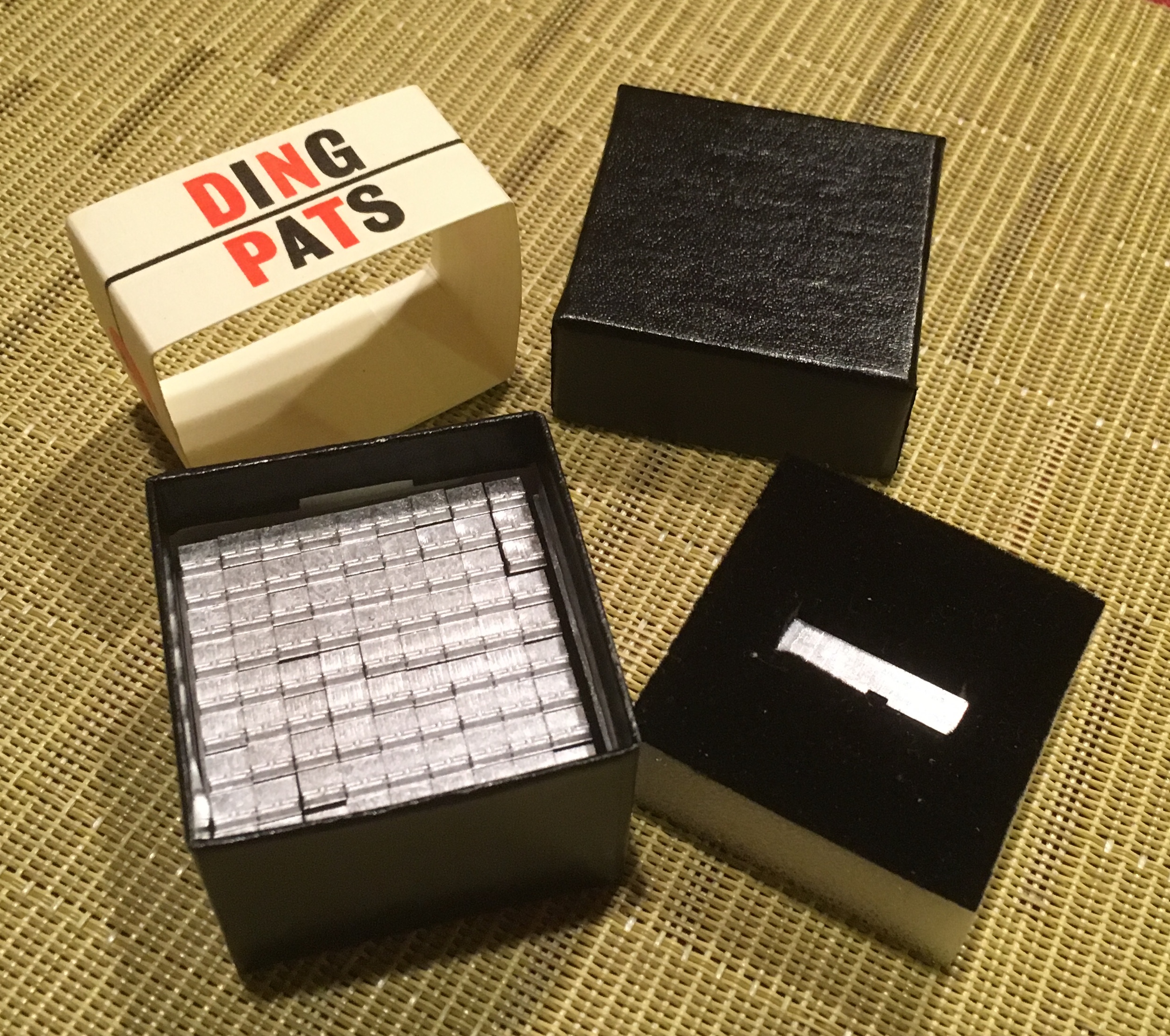
A new milestone in the history of type founding. More than 200 12 point dingbat mats were cast and packaged into groups of 81 to a box.
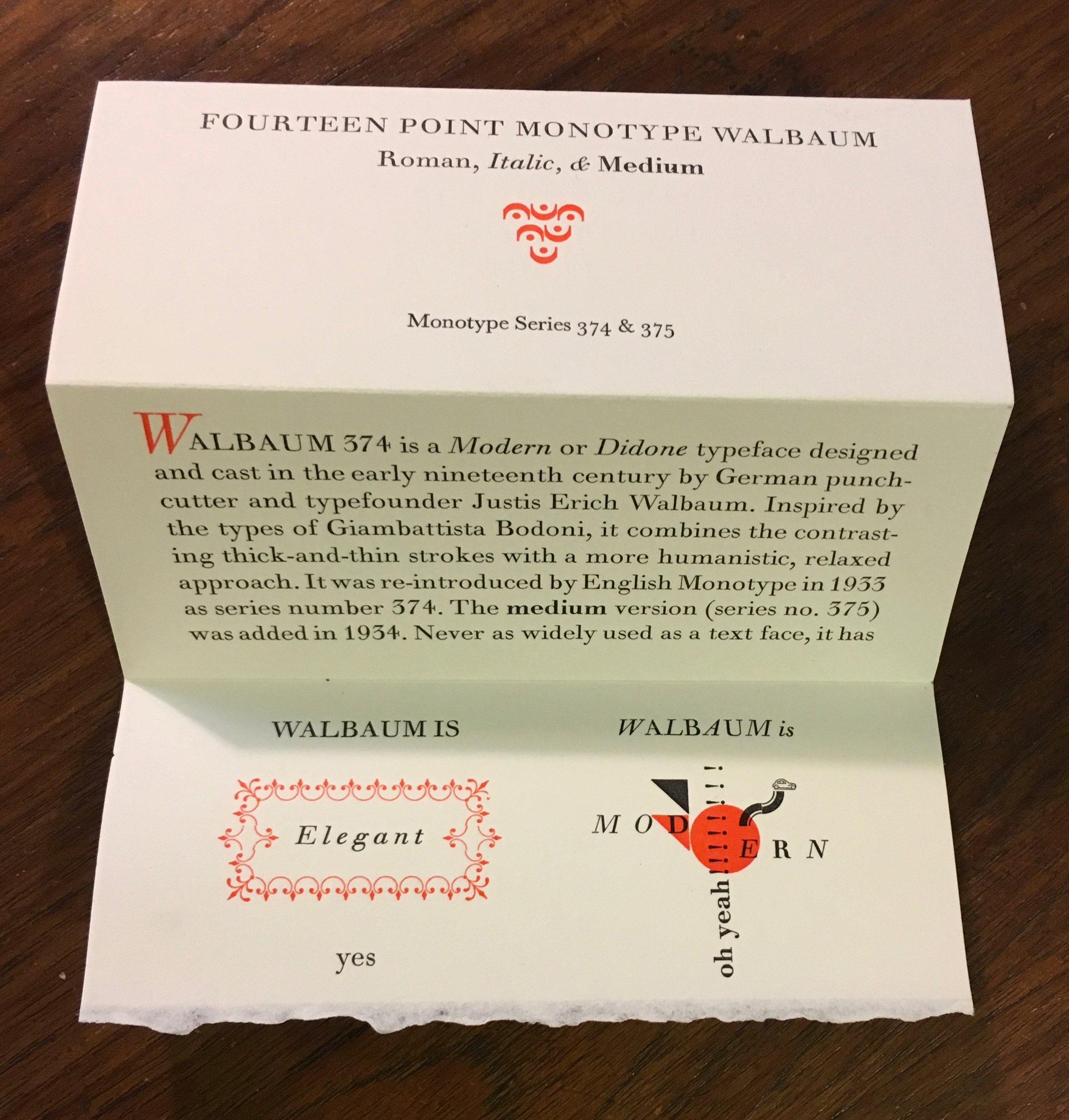
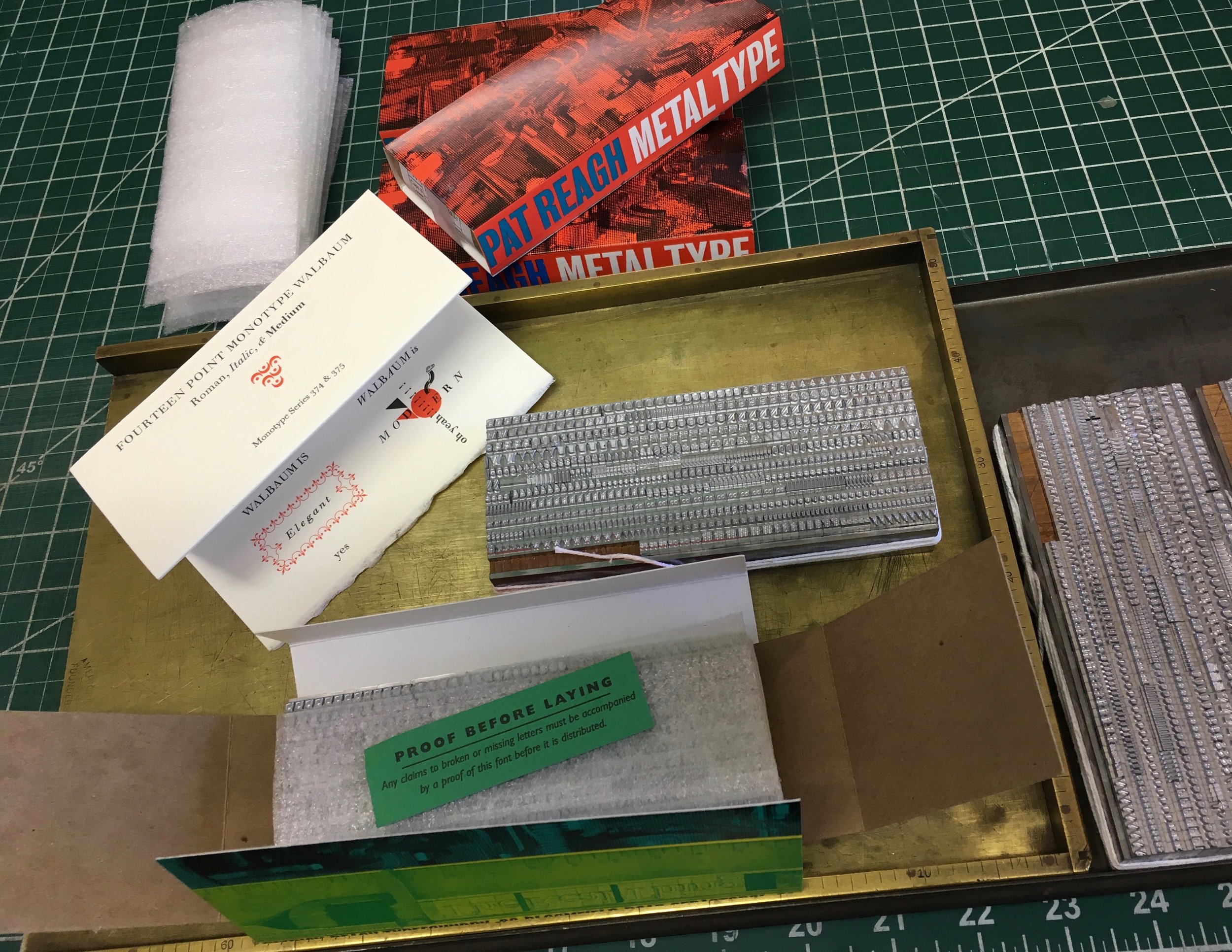
New casting of 14 pt. Walbaum, Italic and Medium. Matrices were from the Monotype printing office and are in mint condition.
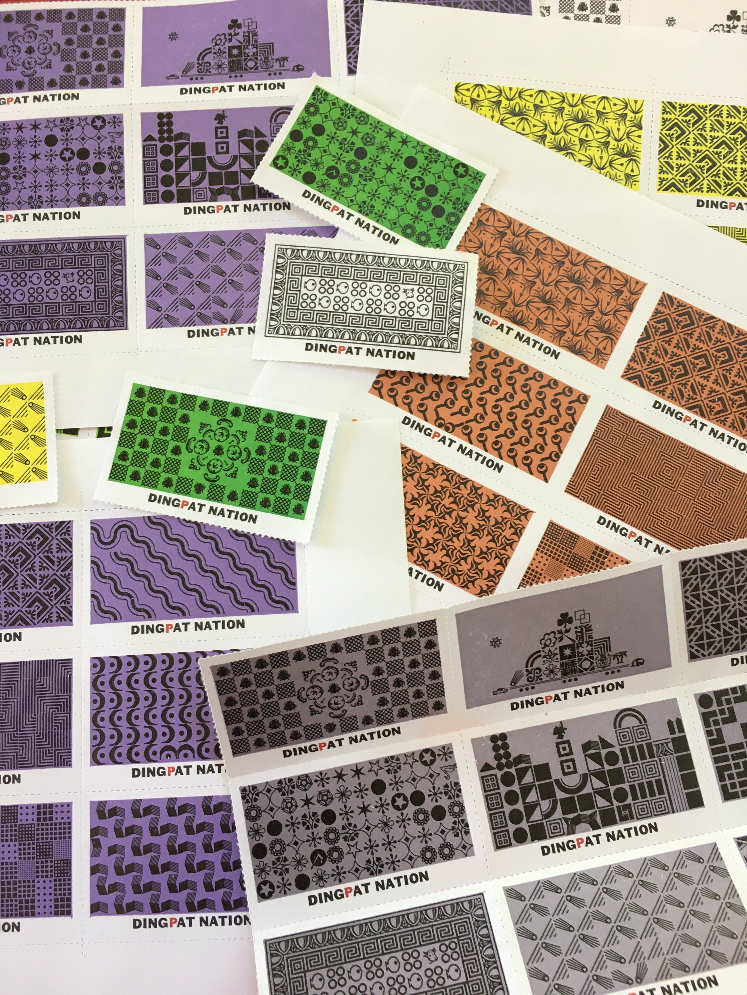
DingPats© were such an international sensation, they needed a nation. Twenty seven different forever stamps (forever worthless for mailing). They show just a few possible typographic combinations.
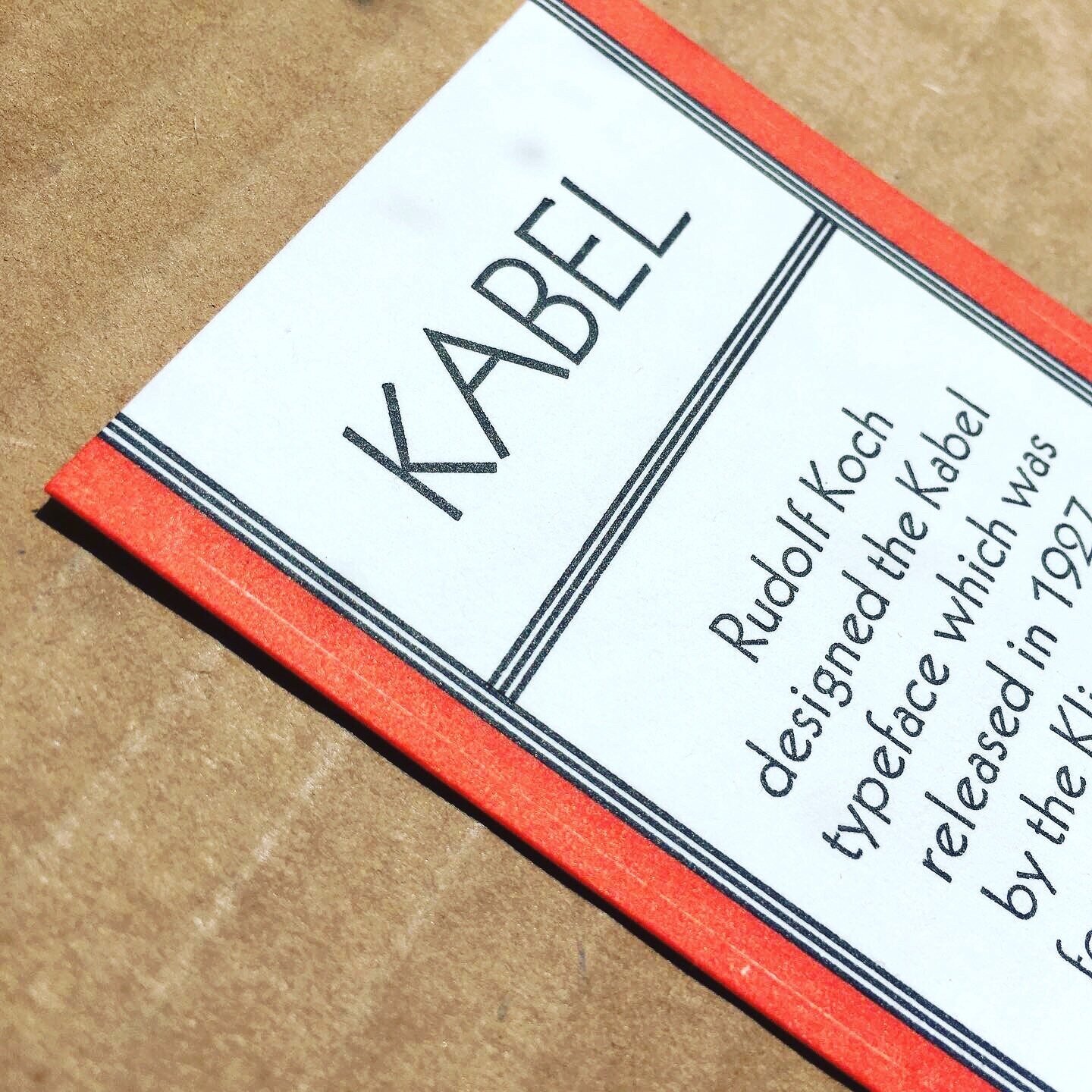
It was Kabel all along until Lanston Monotype abducted it. We cast some 12 & 18 point fonts in September, 2020. Sold out immediately.
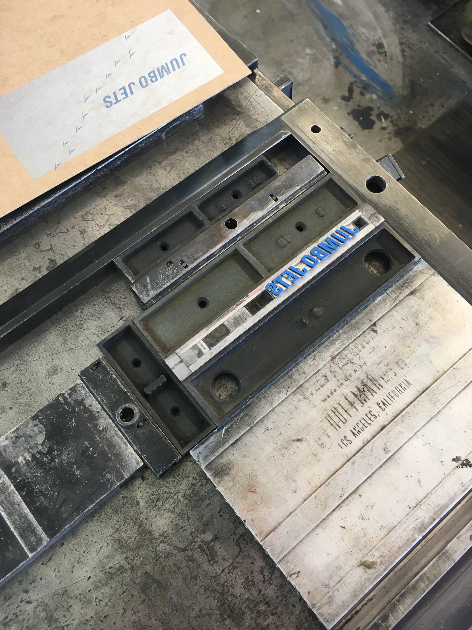
Coming soon to an eager world.
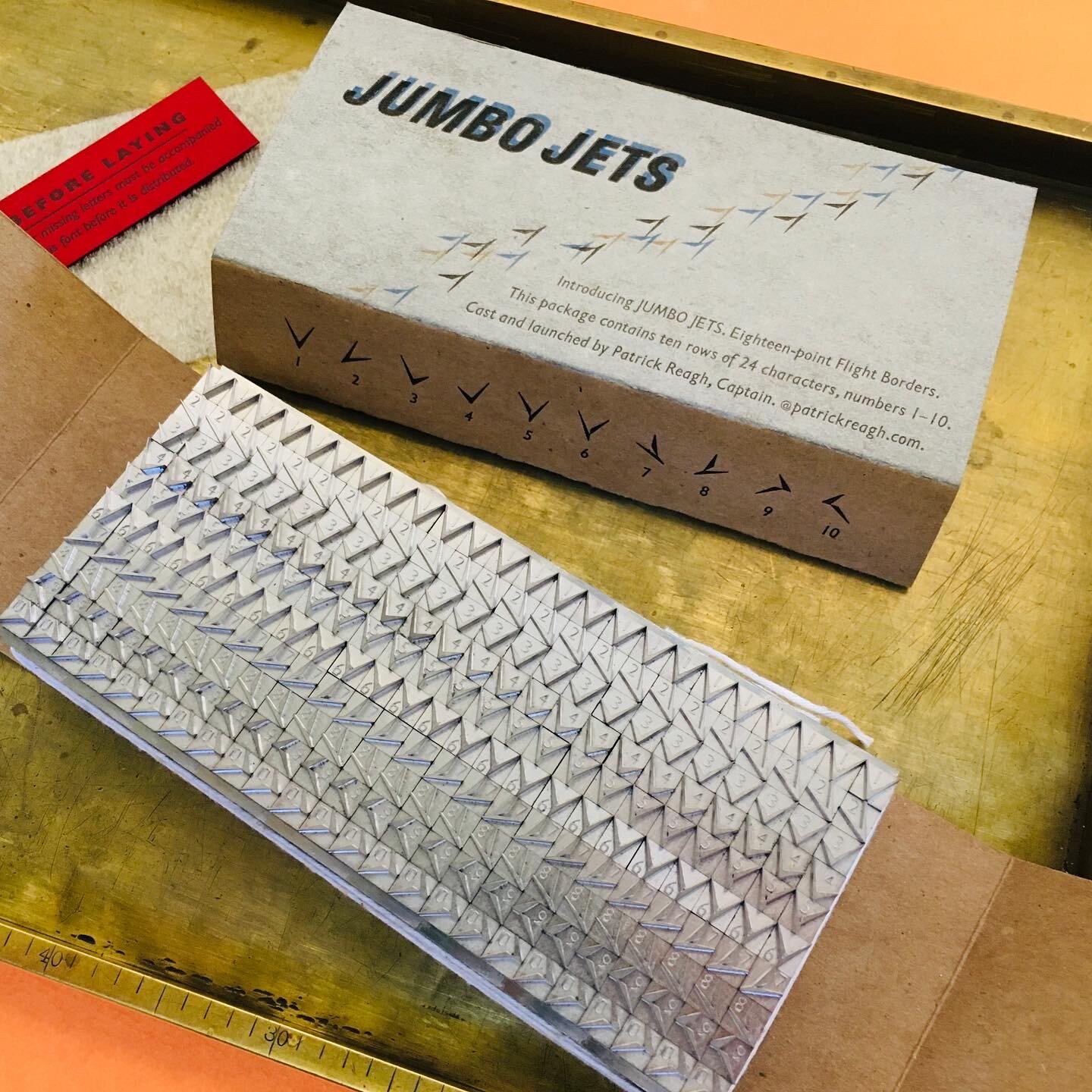
Bespoke 18pt. Flight Borders. Ed Rayher of Swamp Press engraved the matrices. Go big, or go home, eh?
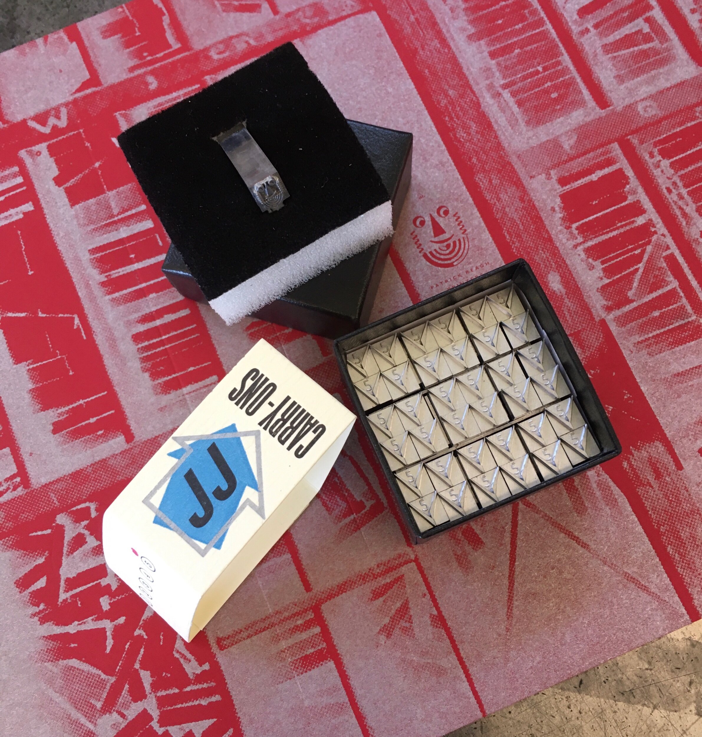
A DingPat-sized box of 36 Jumbo Jets.
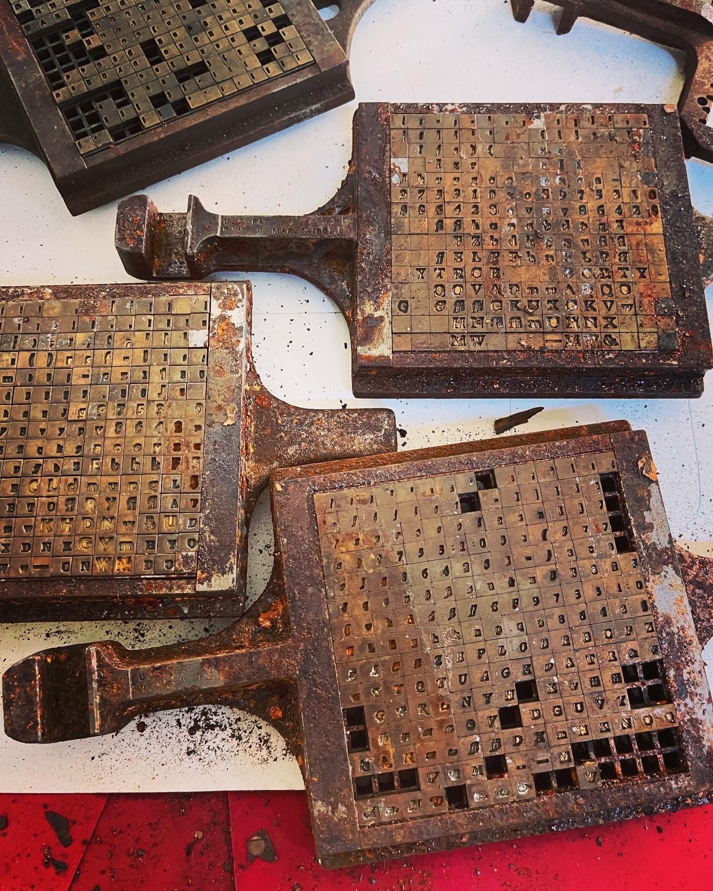
Some rusty old mat cases were restored and the one on the left was put to work
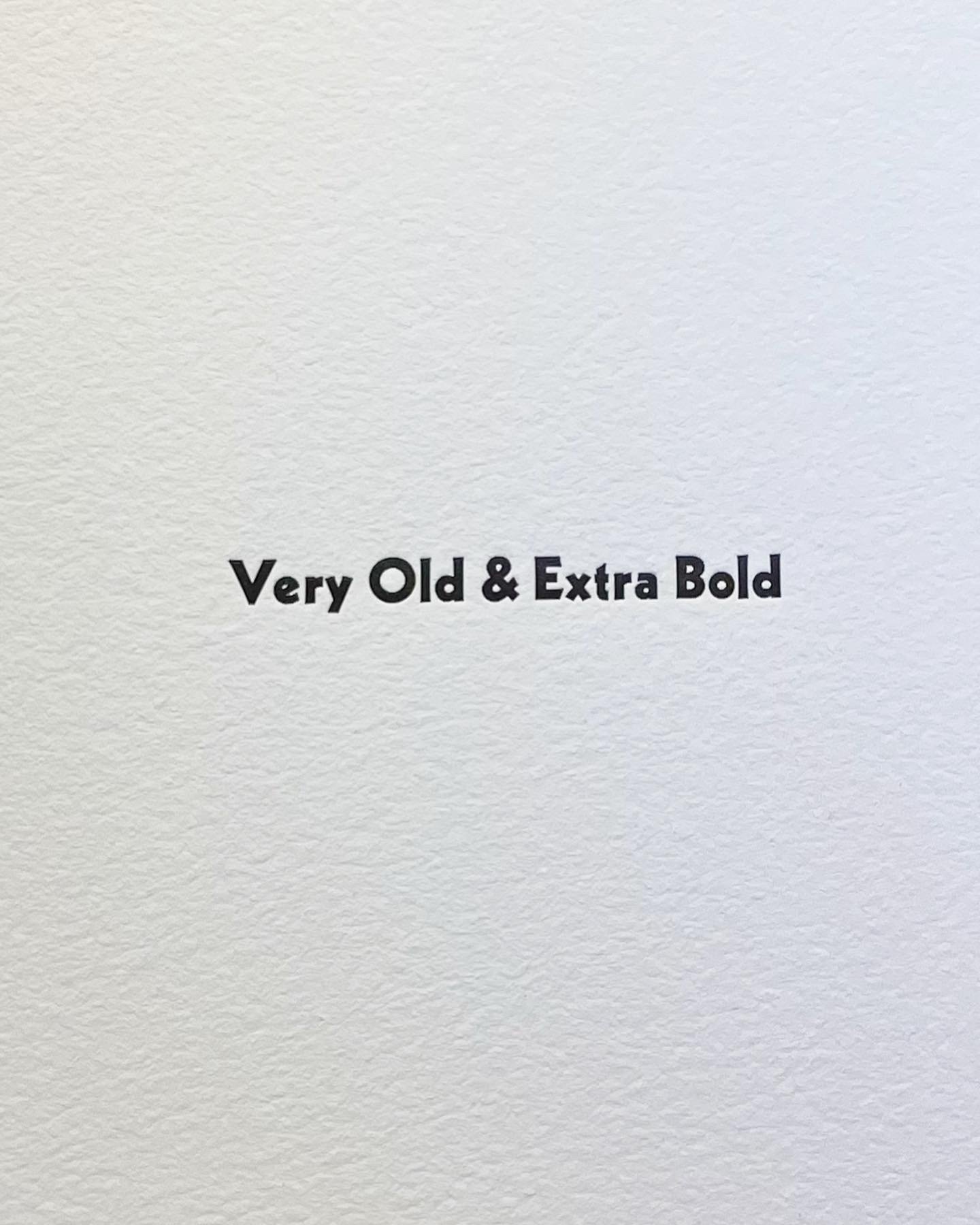
A proof of the type cast from the restored matrices. A testament to the resilience of Monotype technology. The mats are probably 80+ years old.
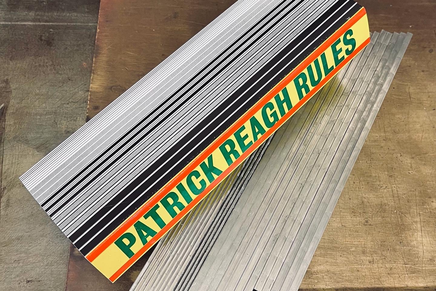
Cast and fonted some 6 & 12 point rule from recently discovered Elrod molds. February, 2022.

Extending the stroke on the 12-point mold made it a bit over-heated.
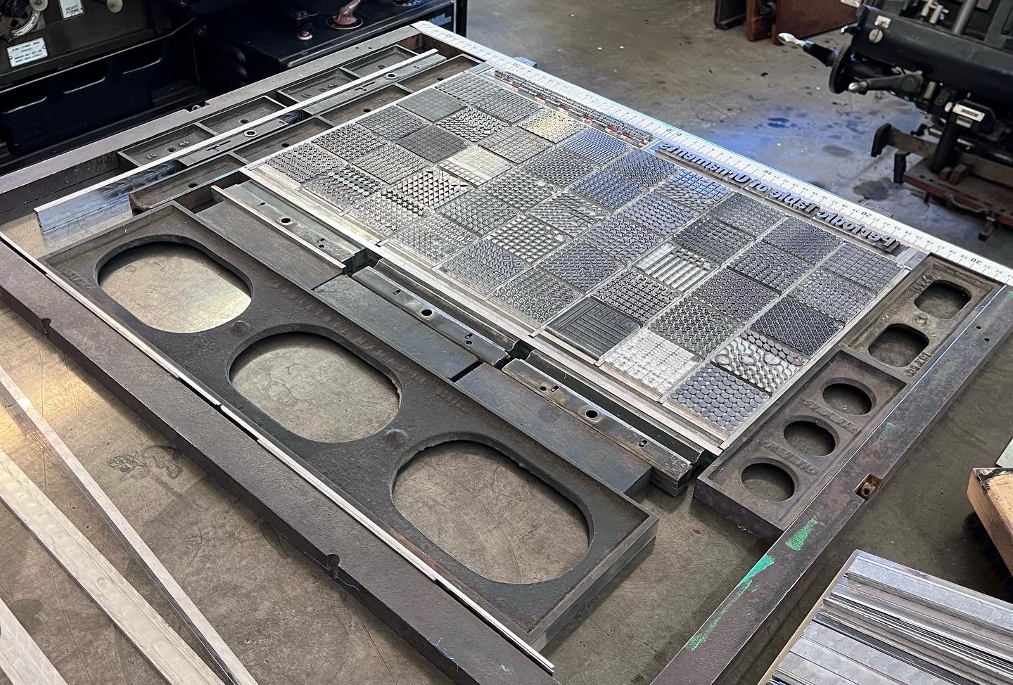
A big, heavy form of 18 point ornaments for a broadside printed 3 September 2022
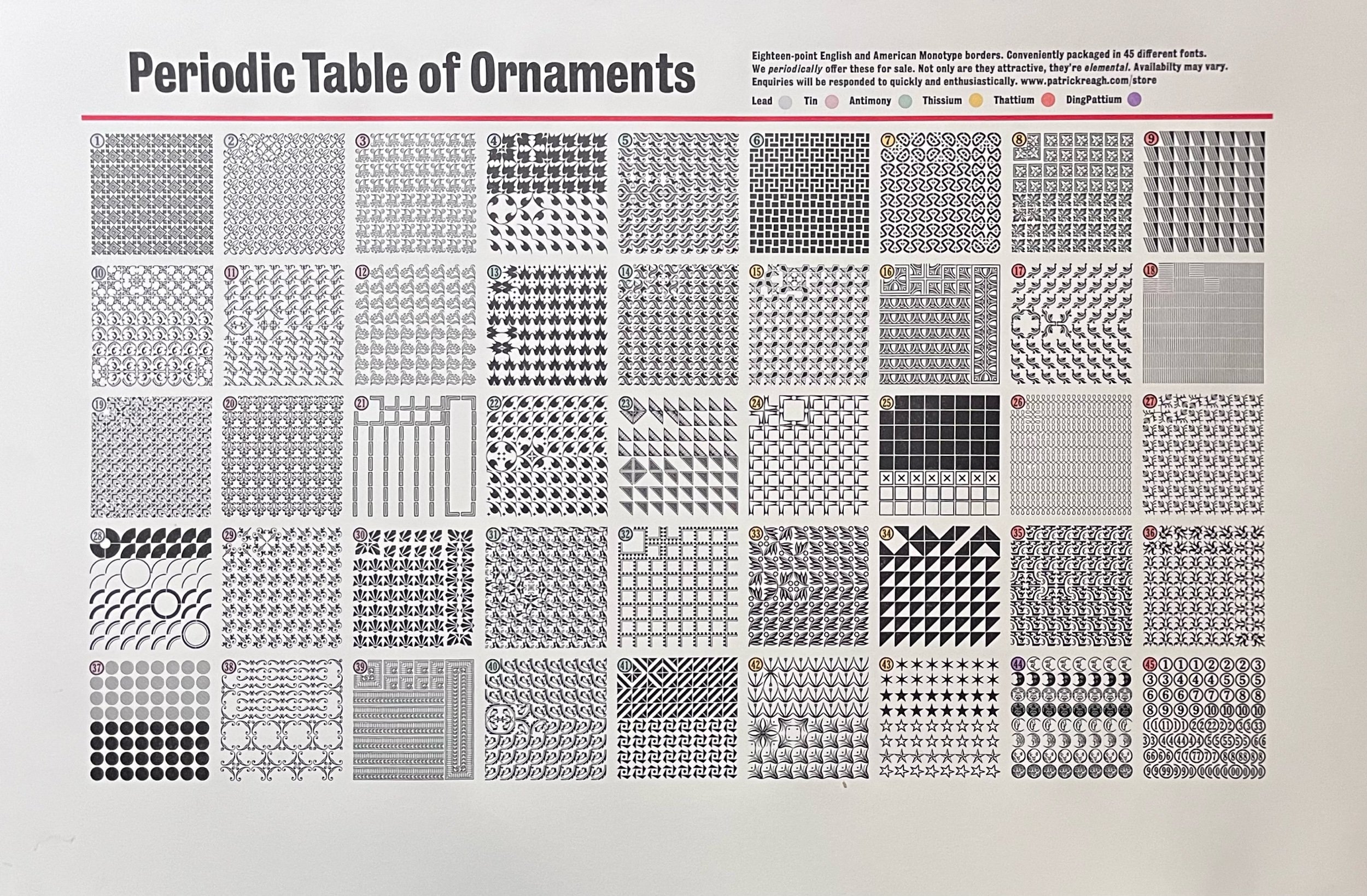
A new broadsheet with 45 fonts of ornaments and dingbats.
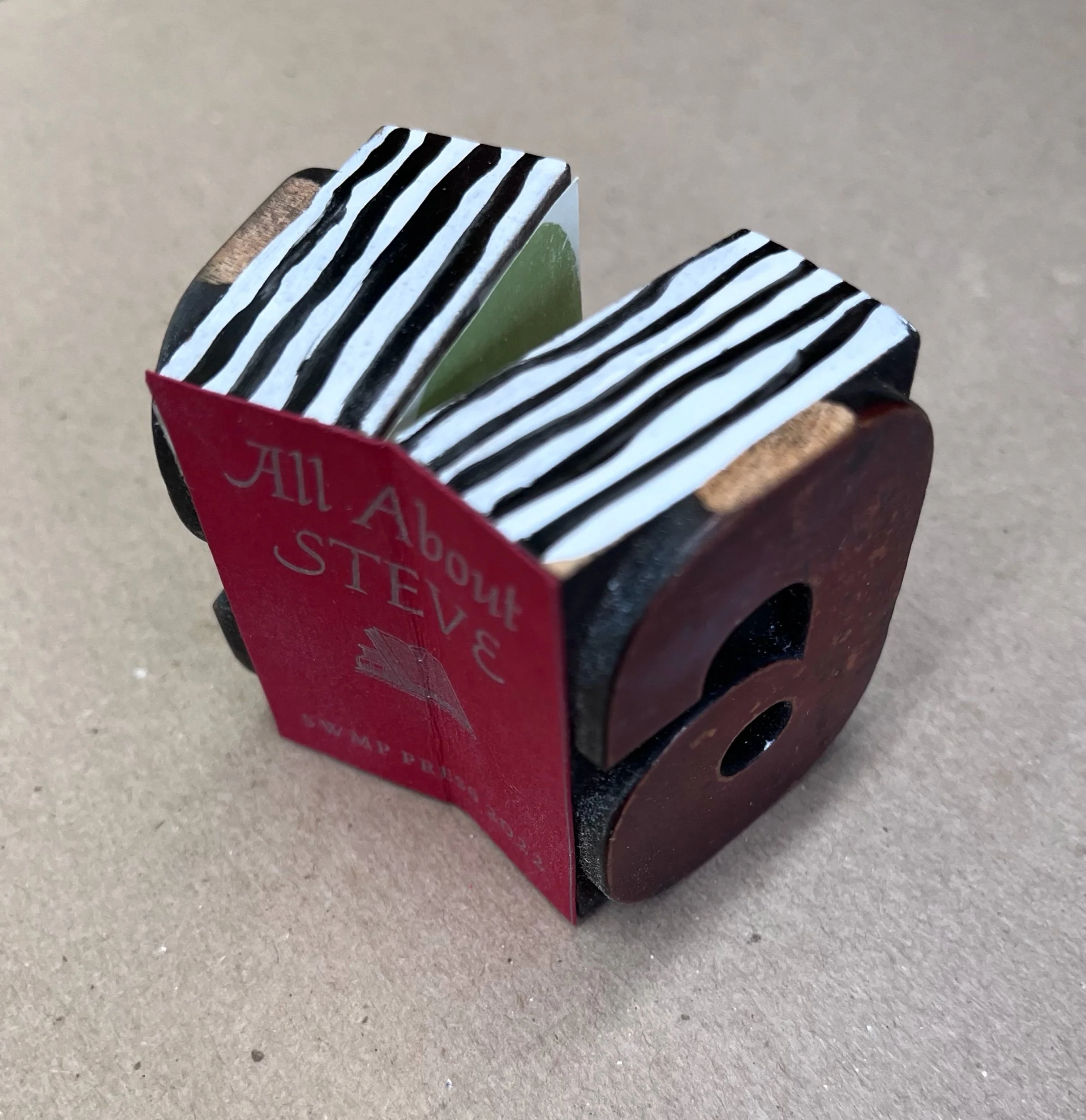
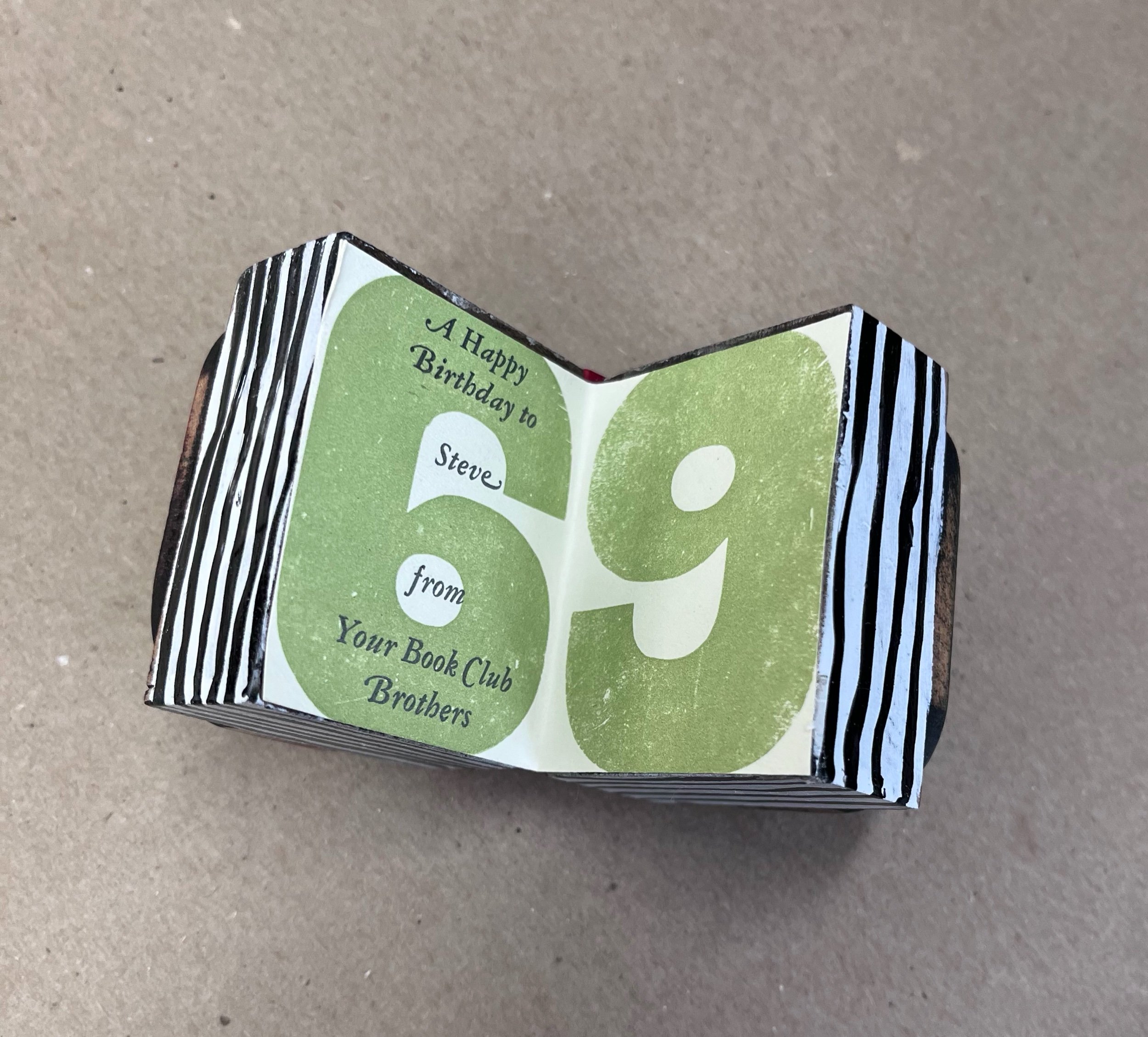
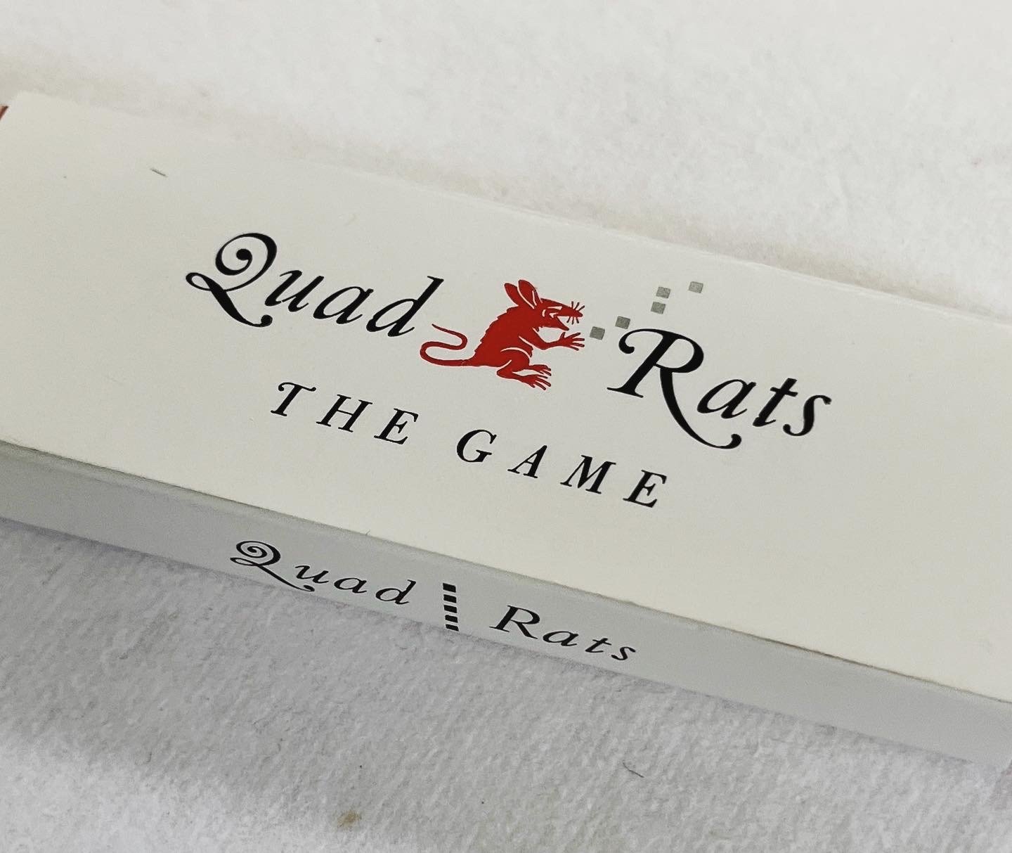
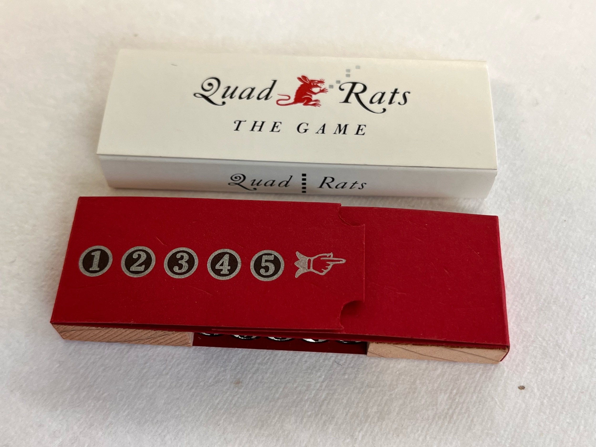
A Recent diversion from the Press. April 2023.
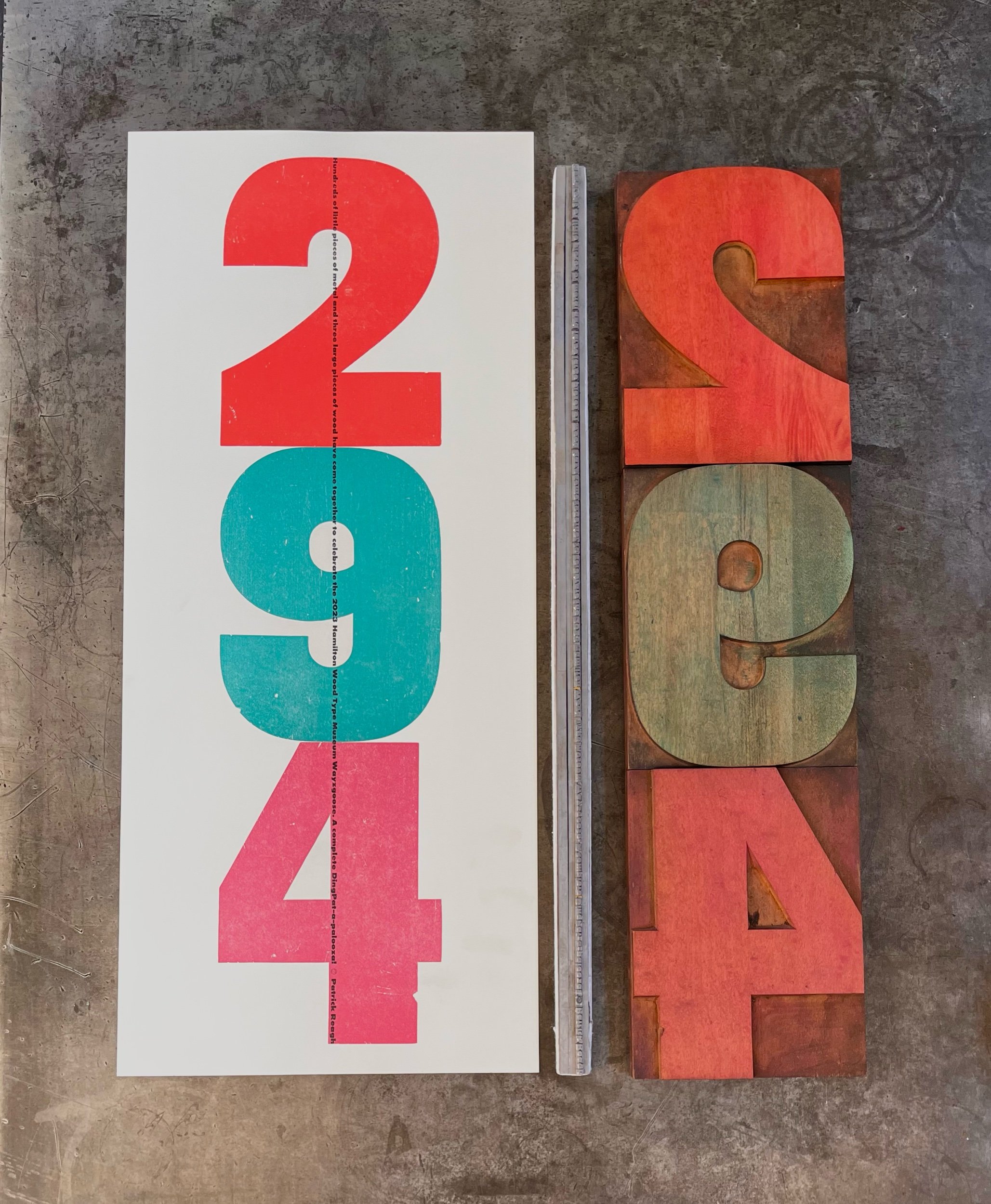
Three pieces of wood type, and the longest line of metal type I ever set: 150 picas.
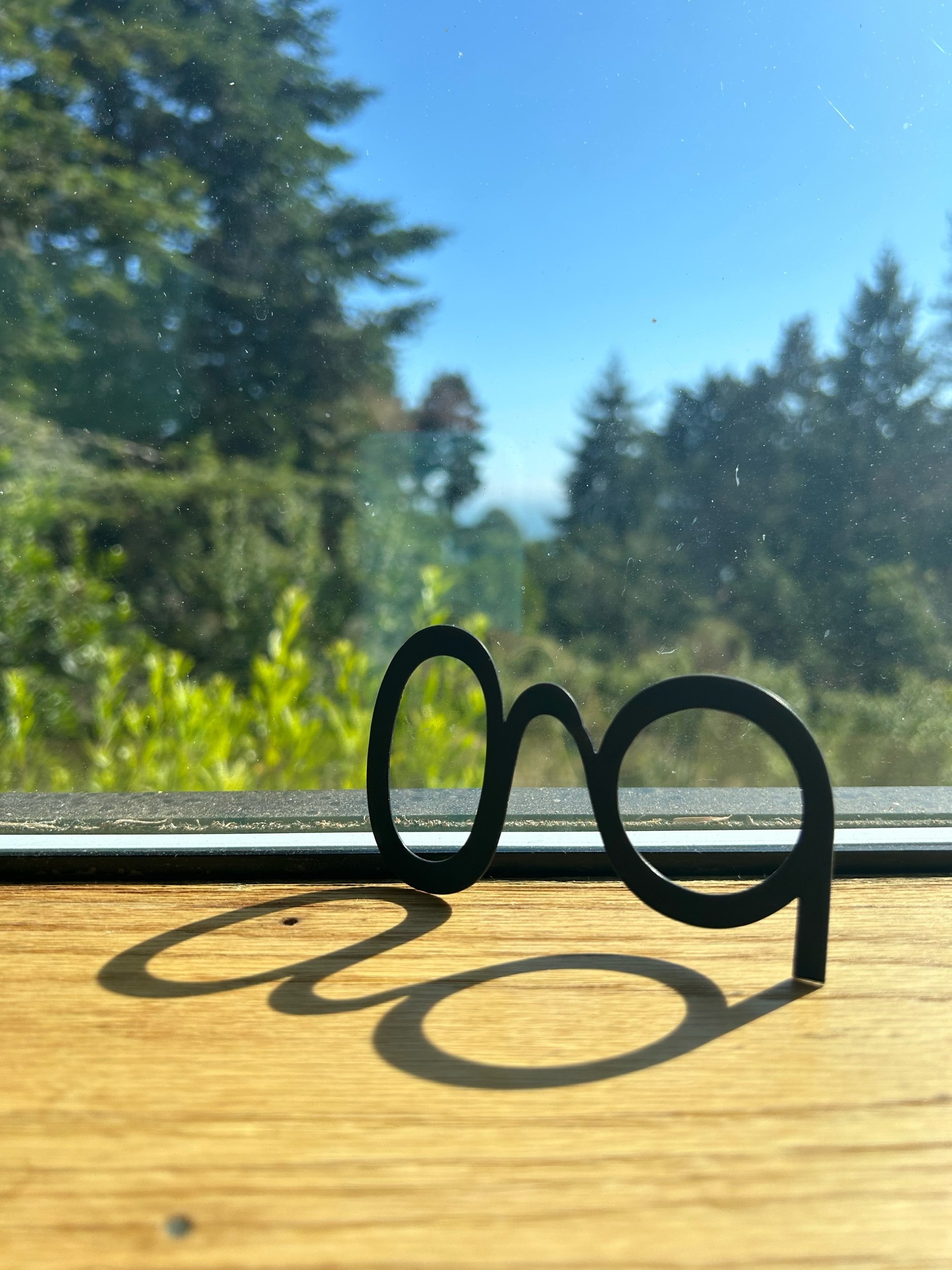
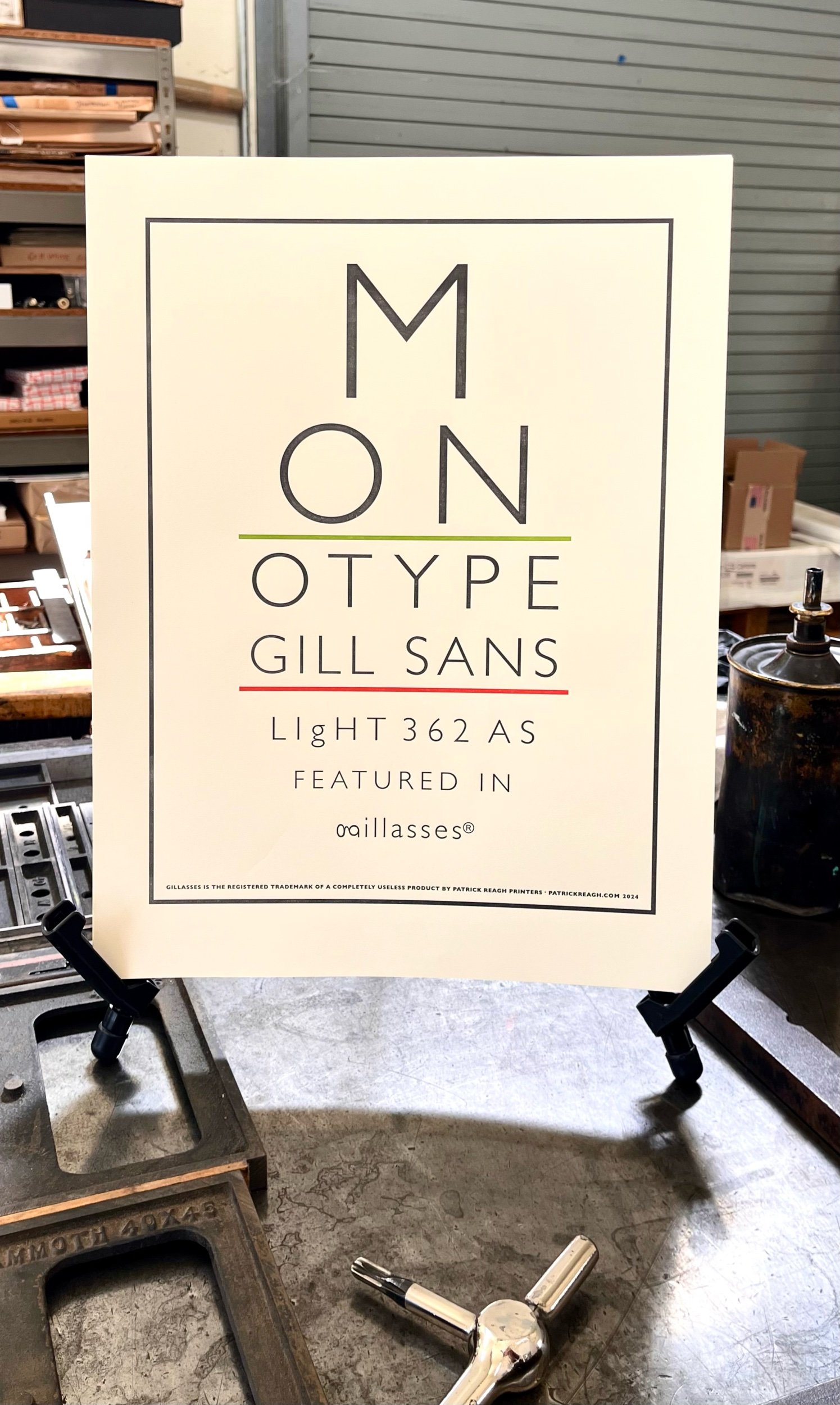
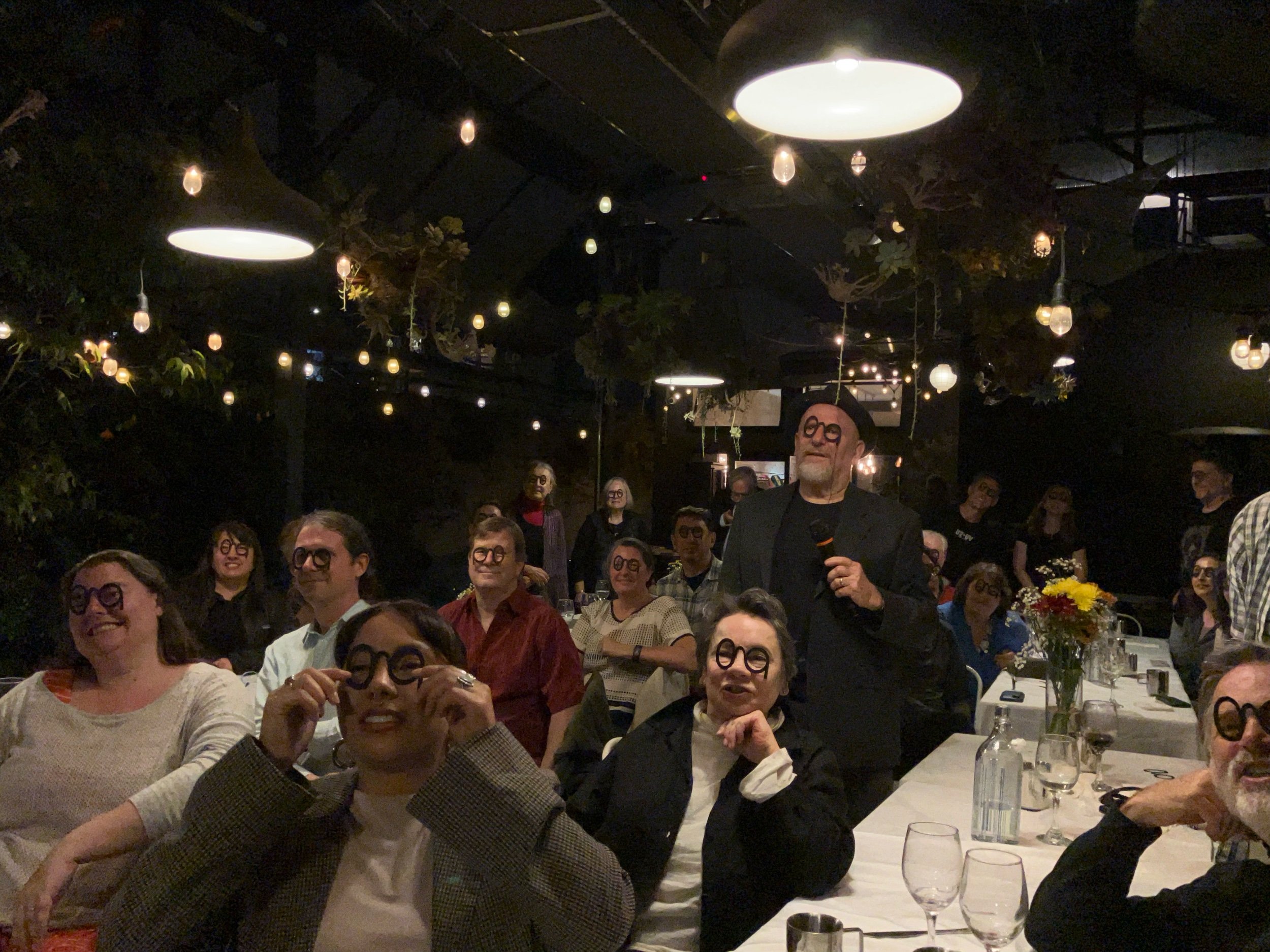
After my speech to the Colophon Club, I introduced Gillasses ©️ to a grateful and worshipful audience. Mirth & Jollity prevailed.




A 36-line wood type card/object congratulating Sandra & Harry Reese upon being awarded the Oscar Lewis Award by the Book Club of California, 30 March 2015.
Printed letterpress, March 28, 2015. 16 x 20.75 inches.
Cast 6 fonts of this old typeface for a client in Canada
from mats that are probably 80–90 years old. April 2, 2015. Additional fonts available from our store.
Mats & type
My friend and client, Ben Kinmont was featured in the Northern California independent tabloid Bohemian. Congratulations, Ben.
My friend Eric Johnson of Iota Press came upon these labels on some unopened fonts (8pt. Times New Roman Semi-Bold) from 1949. Los Angeles Type And Rule Company was my favorite place as a teenage printer. All my allowance money went to them.
Monotype Quad and Space mold. I acquired this mold years ago but never used it. It is for casting spaces from 5 to 12 point. What makes it unique is it has a pin mark for identifying the size on the side of each space. It would be useful for less experienced printers in identifying odd sizes like 11 point to avoid improper distribution.
First casting on 24 June, 2015 .with the Quad and Space mold. The size (12pt.) shown on the side. Pretty cool, eh?
Out with the old, in with the new. Recycling is alive and well at Patrick Reagh Printers. The ancient cauldron, some old type, a propane tank, and voilà! New ingots ready to be turned into beautiful new type. It goes without saying that this beautiful new type is available from our store.
A prized possession. Inscribed copy of Hermann Zapf-Ein Arbeitsbericht (work report). While in San Francisco for the Hermann & Gudrun Zapf Day celebration in 2001, the master graciously and beautifully signed my copy of his book. An old package of Optima italic caps from Stempel is another treasured artifact related to the great type designer.
A keepsake for the Hermann & Gudrun Zapf Day celebration. Designed by Kathleen Burch and printed by yours truly. Rest in peace, Hermann.
Title page and frontispiece for a new book from Nawakum Press and Mixolydian Editions. The title page printing and monotype composition were done at the shop and the blocks and text were printed by Richard Wagener.
The family, friends, and letterpress community suffered a devastating loss with the sudden death of Dave Johnston. He, along with Mark Sarigianis, operated the Prototype Press. A large gathering attended a memorial on Friday, 9 October at Cragmont park in the Berkeley Hills. We will always cherish your memory, Dave.
Our latest casting from some newly discovered mats from the depths of our collection. Fonts are available from the store.
Printed for the Roxburgh Club annual Printers' Gala. December 15, 2015. A registration nightmare.
Newly printed bookplates for the Clark Library. The small book-
plate is 15/16ths of an inch square.
An account of Ben Kinmont's store in Sebastopol where he conducted business until the Spring of 2016. The title is from the sign on the door. Chances were that there was usually someone on the premises.
The interior of Ben's bookshop
A colleague recently lent me the matrices for 24, 30 & 36 point Janson roman and italic. The Press now has a complete supply from 8–36 point.
Antinomian Press Bibliography. Printed 21 February 2016. Another printed-pattern-paper-covered booklet for Ben Kinmont. Alliterations abound.
Dave & Beth Seat
http://www.hotmetalservices.com
travel the country servicing hot metal equipment.
A day's work in my shop, and they gave the machines a new lease on life.
They are a national treasure.
Detail from the title page of The Sea Fogs by Robert Louis Stevenson. A limited-edition published by David Pascoe of the Nawakum Press.
Still life with type, matrices and proof. Six fonts were cast on September 8, 2016 and sold out within 8 hours. A second casting is underway. Fred would be proud.
Many-proofed sheet for David Pascoe from type cast for several Nawakum Press publications. September, 2016.
An invitation using the Flight Borders. Fonts of Flight Borders are available at the Store.
Another example of the fabulous possibilities of using the Flight Borders. Included here is the type used to print the frame. Flight Borders are available at the Store..
This is a picture of Konstantin Lukjanov, our first type purchaser from Russia. Behind him is the The Temple of Christ the Savior in Moscow. It will be interesting to see how he plans on using Ehrhardt. His work can be viewed at maga-book.ru. Stay warm, Konstantin.
We were pleased to be informed that the St. Brigid Press of Emily Hancock utilized our Goudy Old Style in her latest publication.
A spread from the St. Brigid Abecedarium.
In April, 2017, we went to Munich, Germany to meet my four-month-old grand-daughter, Emmie. It was cold, but mother (my daughter, Eleanor), and daughter were all cozy and bundled up.
Eleanor, Armin and Emmie taking a stroll on Zeppelinstrasse. (Blimp Street?)
After going to Munich and Brugges, we went to Antwerp on 5 May, 2017 to visit the Plantin-Moretus Museum and see my friend Patrick Goosens. His collection of old presses and printing and typecasting equipment is beyond belief. I would have liked to have spent a month there. He also manages his family's venerable bakery, the oldest in Antwerp.
Along with Gutenberg and Aldus Manutius,
one of the most consequential printers in history. This sculpture is in the Plantin-Moretus museum in Antwerp.
The wall of the reading annex of the Plantin-Moretus museum. Needless to say it mimics a typecase.
Examining and caressing original punches and matrices for a font of large Garamond, probably about 48 point. I was doing my best to not drool.
A wonderful handset version of the classic poem from Alice's Adventures in Wonderland. Printed by Lawrence Peterson of Nine-eighteen-thousandths Press. The text is set in 12 point Cochin purchased from our foundry. Well done, Lawrence.
A keepsake printed for the Letterform Archive's soirée (16 June 2017) announcing its new addition. The contest mentioned was won by Bruce Kennett who is also the author of a major new book about W A Dwiggins.
The form for the red type.
The terrible Sonoma County fires of October 2017 claimed the home of David and Patricia Pascoe. The inventory of their Nawakum Press was also lost. We were fortunate to have participated in the printing of many Nawakum books. This is a sad affair, but the Pascoes are sturdy people, and we know that they will be back in the swing of things in no time at all. Our hearts go out to them and all the people in our part of the world who suffered a similar fate.
Some long-forgotten matrices of 12 pt. Monotype Jenson #58 were recently discovered and cast into fonts. A copy of William Morris’s Golden typeface by Thomas Phinney.. Cast on May 11 & 12, 2018.
Finally got the Supercaster to cast 14 point. First effort, September 5, 2018.
A new milestone in the history of type founding. More than 200 12 point dingbat mats were cast and packaged into groups of 81 to a box.
New casting of 14 pt. Walbaum, Italic and Medium. Matrices were from the Monotype printing office and are in mint condition.
DingPats© were such an international sensation, they needed a nation. Twenty seven different forever stamps (forever worthless for mailing). They show just a few possible typographic combinations.
It was Kabel all along until Lanston Monotype abducted it. We cast some 12 & 18 point fonts in September, 2020. Sold out immediately.
Coming soon to an eager world.
Bespoke 18pt. Flight Borders. Ed Rayher of Swamp Press engraved the matrices. Go big, or go home, eh?
A DingPat-sized box of 36 Jumbo Jets.
Some rusty old mat cases were restored and the one on the left was put to work
A proof of the type cast from the restored matrices. A testament to the resilience of Monotype technology. The mats are probably 80+ years old.
Cast and fonted some 6 & 12 point rule from recently discovered Elrod molds. February, 2022.
Extending the stroke on the 12-point mold made it a bit over-heated.
A big, heavy form of 18 point ornaments for a broadside printed 3 September 2022
A new broadsheet with 45 fonts of ornaments and dingbats.
A Recent diversion from the Press. April 2023.
Three pieces of wood type, and the longest line of metal type I ever set: 150 picas.
After my speech to the Colophon Club, I introduced Gillasses ©️ to a grateful and worshipful audience. Mirth & Jollity prevailed.
